Role
Sr. Product Designer
Company
Redbubble
Year
2018-2019
Project Overview
Redbubble is a Melbourne based company with a 12 year history of being one of the top resources for independent artists to showcase, sell and fulfill their designs on a variety of products to customers across the globe. In an effort to solidly break into the US market, and continue to support the hundreds of thousands of product SKUs, I was hired to join the US-based product team as their first product designer. Together, we tackled the backend “monolith”, breaking it into a series of lighter weight apps, and focused on both optimizing and migrating each of our 68 customizable products onto a new Shop App platform.
During this time, Redbubble was announced to have officially become profitable.
Tracked Metrics
20% increased CVR
418% improvement in speed and performance
5x faster new product launch and reduced DEP effort
Add to Cart + Favoriting + Bounce
SETTING THE STAGE
Before jumping into this project, I synced up with the PM and Engineering lead to discuss how we could get the most out of our team and how to best integrate design thinking in our opportunity assessment and discovery process. We all valued full team problem solving, and in order to make sure we were all on the same page, I facilitated a quick alignment session to kick us off. This was a great way for us to set the stage for effectively working toward a common goal.
The Google Ventures Design Sprint is my favorite process for opportunity assessment (through validation). It can be tailored to fit quick thinking projects or support in-depth, feature heavy ones.
In this case, we needed to identify a long-term opportunity and support it with relatively immediate validation. Our anchoring OKRs were around increasing new user acquisition (particularly in the US), improving conversions and increasing our product portfolio, so I crafted some how might we’s for us to riff on a bit. Reviewing our initial thoughts, we connected them to some metrics and agreed upon a solid space in which to begin our discovery work.
OPPORTUNITY SPACE
How might we…
…show new users coming from Google Shopping and Organic Search relevant information faster to promote higher engagement and increase buyer confidence?
EXISTING DESIGNS
PROBLEM
We recognized 40% of our users (many of them first time customers) are landing on our product page, and our mobile traffic had now surpassed desktop. Half of these visits were coming from Google Shopping. Our bounce was high compared to industry standards and we had a lot of room to improve conversion.
My immediate take on where some of these product page issues stemmed from:
Second-rate mobile experience
Not simple, over-cluttered
Missing information that people would likely find valuable
Frustrating & time consuming configuration interaction
No brand messaging for new users
Painfully slow
Our “monolith” backend was doing too much, we needed to reconfigure it to be much more light weight
One-size fits all solution for multiple product types and user segments
Someone shopping for a t-shirt has different needs than someone shopping for wall art and canvases. Same in the case of who they are and where they are in their journey.
Complex to extend and configure
Hard to use the data to build new experiences (like mobile apps)
Difficult for us to experiment in vital areas
A lot of DEP effort spent maintaining and launching new products
Difficult for marketing to access and make an impact
STRATEGY
By focusing on a segment that had specific needs we could quickly validate the impact of a new experience, speed and the potential of the Shop App platform.
We decided to focus on the t-shirt apparel experience, as it accounted for about 31% of our total revenue, would easily translate to 16+ products immediately and encompassed a relatively complex configuration set that could be simplified for full product migration should it prove successful.
RESEARCH
At the onset of the project, I worked with our research team to conduct a series of internal stakeholder interviews and user sessions, coupling them with a bout of desk research around general shopping, Google shopping and RB shopping behaviors (much of which existed in our extensive repository of confluence documentation).
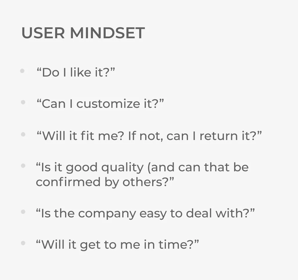
We focused on “express transactor” users early in our user framework (connect, assess, discover, buy), paying particular attention to the “new user” segment. These users were specifically coming from Google Shopping with a general idea of what they wanted to purchase. We just needed to make it easy for them to do so with confidence.
It was important that we understood the priority level of users’ seeking behaviors and expectations as we sought to optimize the new experience, as these were the end jobs we needed to be able to assist them in achieving. I had users rank these, and kept them in my back pocket to reference while designing the new product page.
Now able to break the job requirements down by degree of importance, I wanted to get a sense of how users prioritized actual feature sets against these needs. We ran a quick optimal sort battery on the backend of these preliminary listening sessions, which helped provide a bit of guidance come feasibility review.
For example, I now knew that users’ number one need was to ascertain the size and fit of the garment. As product previews were a top ranked feature, one could hypothesize that users expected to be able to do this easily by using previews alone (particularly users buying t-shirts for others as a gift). Visual merchandising was not in our scope, but I was able to communicate this requirement to the appropriate team who helped get us to a better point in this area while we worked on the other feature sets in tandem.
FEATURES
Top 6 based on user ranking
Previews
Product features
Delivery times and cost
Ratings/Reviews
Comments
Size and fit guide
Another example of how this knowledge aided priority and scope: knowing we could do little in the way of optimizing the preview imagery (apart from making the image larger and more obviously swipeable), another way we could help them understand size/fit better was to offer an easy to find size guide in context (under the size options rather than far down the page). This was not in our scope at the onset, and would take some extra collaboration with another team, but after some quick validation (detailed in the design decisions sections below), we determined its importance and made it a bigger priority. Later, I worked with the Product APIs team to help feed the dimensions API into a dynamic size guide that could be scaled to all product types and updated easily, taking the sizing information out of a static image.
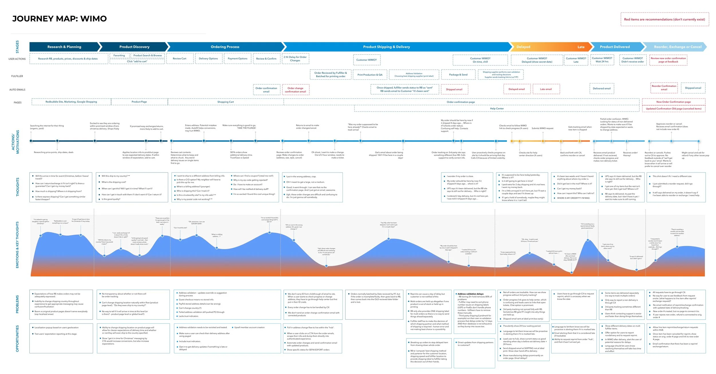
One final artifact I created with the help of our Customer Experience team was a fairly comprehensive journey map. Before making big changes to such an important page in the buy experience, I wanted suss out potential areas that would impact order changes/cancellations, returns and exchanges, and WIMO requests (e.g., where is my order?) - all of which needed CX support, which meant money spent. My base objective here was to do no harm and considered any improvement in reducing these things an added bonus.
THE FAKE GOOGLE SHOPPING TEST
I had a pretty good idea of user requirements and expectations at this point, but was missing a few elements to feel completely satisfied. For one, I wanted to see how users who had never heard of Redbubble go through the early journey of shopping without bias; having them go directly to the product page was not going to allow me to do that. Secondly, I wanted to observe early shopping behaviors prior to landing on the RB site. In response, I launched a fake Google shopping test.
Pairing closely with an engineer, I replicated the Google Search bar in our testing environment, and when a user searched for a keyword, we lead them to Google shopping with all results filtered to only show Redbubble results.
*Make sure to include a product type in your search. For example “pug shirt”, “wolf blanket”, “funny case” etc.
BEHAVIORAL TAKEAWAYS
Decisions are made before reaching Redbubble. Things like artwork, style, color and price are considered and decided well before arriving to the product page.
ATC Button acts as ‘end of the page’. We discovered users would get to the add to cart button and immediately scroll up to reconsider all information they’d gathered at that point. This was unfortunate, because many of the features users described to be important in their buying decisions (e.g., delivery info, product details, reviews, etc.) and others that would promote going deeper into the browse journey (e.g., recommended products) were all below the ATC button.
Color config could be more in context. The color selector was positioned in a location that was exhausting for a user to select and see preview changes (if they knew it changed it at all), as they’d have to scroll down to choose, then back up to see the new preview image.
Styles dropdown could be smaller. In the Google shopping flow, the user already knows they like the style (and often, gender) of shirt, and it was the first selection, shown largely for added scroll, for the user to have to pass to get to more important consideration elements like color.
Tabs often overlooked. Again, important information like reviews and recommended products were sequestered away in tabs (and below the add to cart button), which were not as often interacted with as we would like.
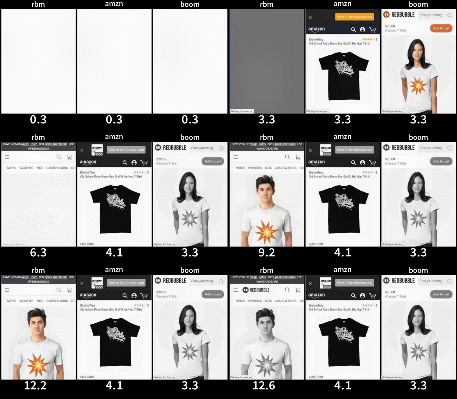
Slow to load. Previous research shows that time constraints are one of the top reasons why a user would leave the site. This may account for why our bounce was so high.
THE NEED FOR SPEED
“When eBay rebuilt itself and spent lots of money on search/relevance, mobile, and other initiatives, it was 1 initiative alone and one of the cheaper ones that brought in the biggest gains (as calculated in a lift in revenue) and that was site speed. In particular perceived site speed for the user”
-Hugh Williams
It was clear we needed to improve our performance in order to be competitive, and our bounce rate was there to prove it. This, however, was a problem a bit out of my wheelhouse, so I reached out to a technical design colleague who was in the process of validating our design team’s need for a design system. Together, we broke down each of the potential modules against our prioritized feature requirements, using my early mocks as reference, and tackled the backlog together, designing with React and systematically added them to the new Redbubble Design System.
This was the beginning of our new Shop App (aka “boom”, as seen in the above illustration on the right). Essentially we broke away from the teetering “Monolith” with a lighter weight backend that only managed product pages. This move was extremely effective, and successfully shaved down our load speed by 4-5x.
A MODULAR VISION
There were some added benefits in designing with React and building out our design system with componentry patterns in mind. Design parity and collaboration is an obvious one that we all love about it, but it paved the way for us to be more flexible and quick with our experimentation process. Before now, it had been extremely difficult to even get an A/B going.
The design system team was already tracking componentry interaction to prove out their efforts. Inspired by this, I worked with our engineers to put together what we call the “Experience Framework” (which was essentially an interaction tracking dashboard, tracking engagement metrics we found to be important in a particular user journey). Our old model made it very difficult to do anything remotely close to this.
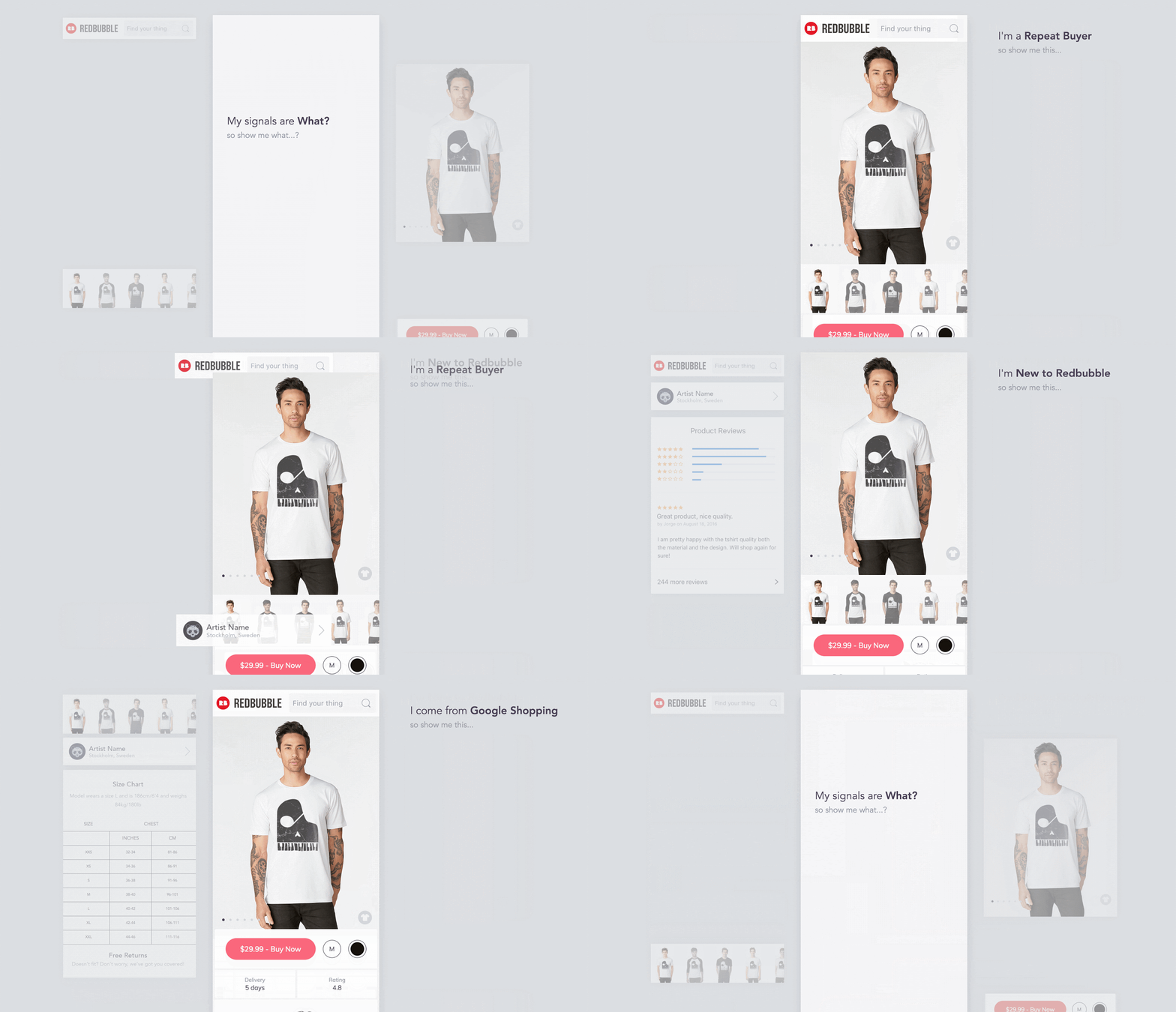
The most exciting use case, however, was our potential ability to better target experiences with signals-based layouts and messaging in the future, of which we’re just starting to scratch the surface.
DESIGN DECISIONS
There were many. To make this a bit more bite-sized, I’ve highlighted a few of my choices based on three design principles I used as guidelines throughout the project:
MAKE IT SEAMLESS
REDUCE ERROR STATES
MAKE IT EFFORTLESS
SEAMLESS INTERACTION
Research indicated our users expected to see a preview of the colors they selected, which was supported, but a bit frustratingly. The current experience had them scrolling down to configure, then back up to see the new preview image. It was time consuming and unnecessary.
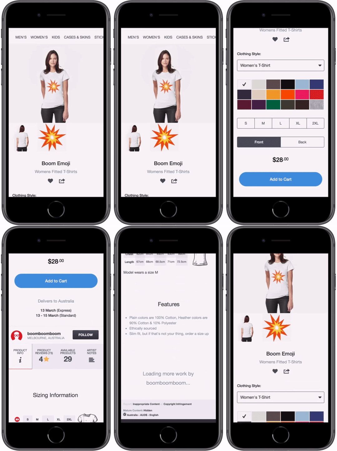
I overlaid an action button on the preview image, revealing a color picker carousel for easy comparison behaviors. This turned out to be a favored feature amongst our users in our validation sessions.
CHALLENGE: Though ideal for a mobile experience, it did not translate well to desktop, as it was visually separated from the rest of the configuration sets and ATC. In this case, I deconstructed the carousel and included it in the config panel, which has been working fine, but can still use a bit of iterating. It was, however, great feedback for our iOS team, who integrated this interaction into our app experience with positive results.
NO ERROR STATES
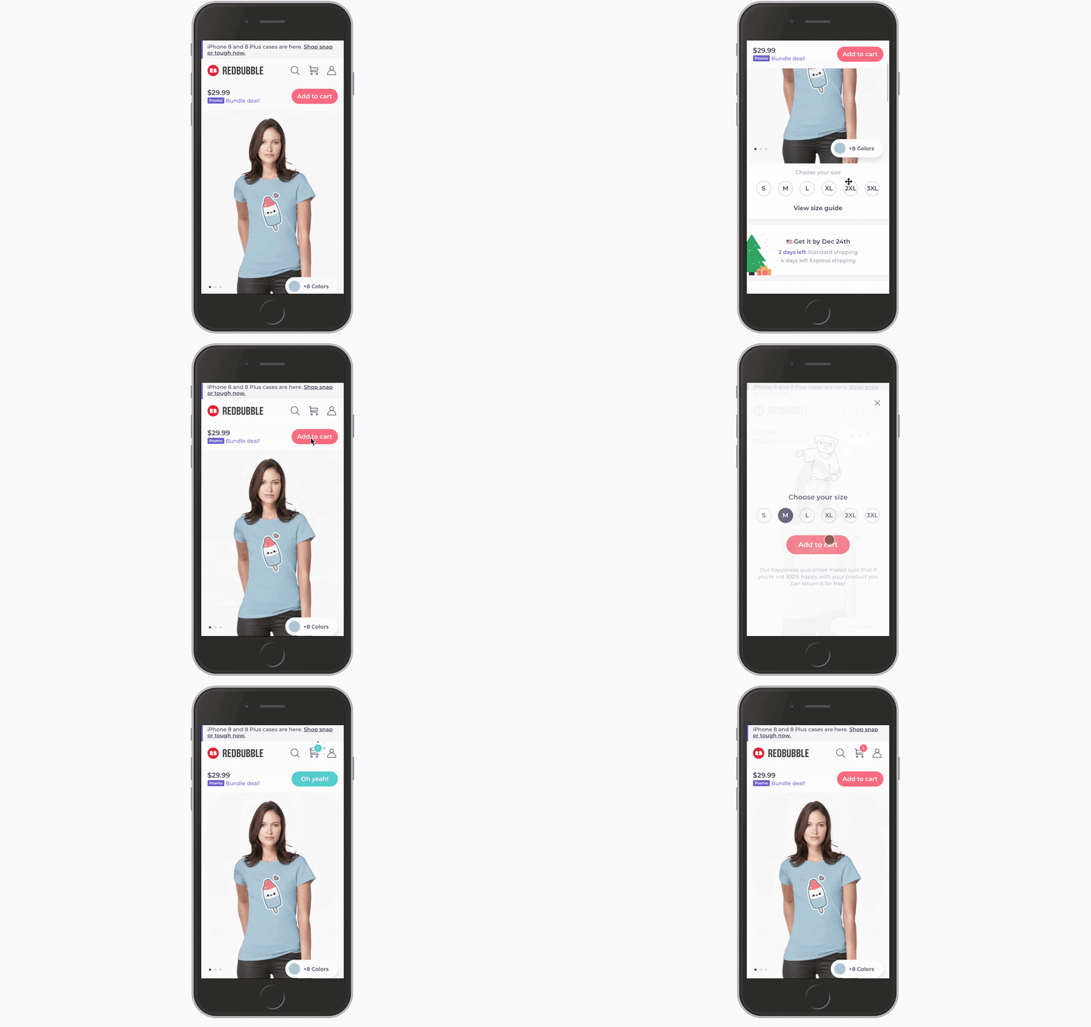
It is bad practice to solely rely on error states, especially when you are urging the user through a *fun* buy journey. Default size selection can also increase returns and exchanges (something I’ve actually very recently done out of sheer excitement in ordering the item, it was a disaster).
In the case of a user adding an item to their cart without first selecting size, I revealed a quick popup to handle the missed config with the following mindset:
Positively highlight actions, don’t make it feel like a “mistake”.
Opportunity to highlight trust signals (e,g., easy returns/exchanges policy)
Size guide feature at the perfect moment of need.*
CHALLENGE: The size guide was not included in my first prototype here, as we hadn’t yet prioritized it. To quickly validate the need for it, I put a link to the help center sizing info and tracked clicks. It was definitely a feature people wanted at this level, and we recognized taking them away from the page to the help center was not good for CVR, and size guide needed to be prioritized.
EFFORTLESS EXPLORATION
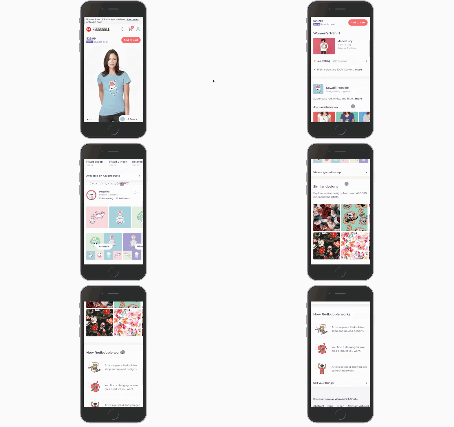
When in doubt, allow the user do less to get more. In the case of the product page, scroll actions take far less effort than flipping between tabs to gather important information, which is what we were currently doing.
Feature most important actions and info in highly visible, expected locations. Research indicated the following needed some love*:
Clear Price + Deals
Add to cart
Larger preview image with easy swipe gallery
Delivery info
Size and fit guide
Take product info out of tabs
Anchor with imagery for easy scanning
LEARNING: Future iterations included more visible reviews as we discovered users heavily relied on them to determine size/fit and quality, and new users considered them to be a valuable trust signal.
FINAL DESIGNS
IMPACT
We would definitely call this project a success. Going in, our major hypothesis was that simply speeding up performance would improve our bounce, and our conversions would naturally follow. We improved load time by 4-5x, and increased conversion by up to 20%.
We successfully validated that with some tweaks to the design and by speeding up performance, we would experience some pretty significant wins.
The way we worked together cross functionally enabled us to set up a backend that we eventually set up to migrate the rest of our 40+ products, significantly decreasing our DEP effort around launching new products and maintaining the existing ones, which I can go into more if you press me ;)
IN RETROSPECT…
Of course we’d all like to be able to say everything we do is flawless. Sadly, that’s impossible, but the silver lining is we learn along the way. A few things I learned and would perhaps done a bit differently:
It was difficult to tell which features of the new product page were the most responsible for improving our add to cart and conversion rates. I pushed for a BIG change just to get us in the wheelhouse of where I wanted us to be, but in doing so we lost a bit of granular understanding that could be backed by site data, not just user sessions. Would I do that again? All things considered, yes, but I don’t recommend it for steady optimization, and it certainly was a gutsy move to throw such a big design overhaul at a validation effort.
Doing smaller, more frequent validation sessions around my design decisions would have helped with that lack of full understanding around what was and wasn’t the most instrumental in our success. Though I made sure to include them, they always felt expensive and I’d try to limit them as much as possible. Given our current strategy around rapid optimization, this is extremely important for us to adhere to or we won’t be able to communicate to the rest of the company what we’ve learned.
ON THE HORIZON
After migrating the rest of our products to the new Shop App platform without doing any harm and getting our Experiment Framework in place for rapid iteration, we are now in a position where we can start optimizing and building out a signals-based strategy.


