FRANKLY CHAT SDK
Below is a high-level overview of my process, from conception to delivery. If you would like to see more research, take a gander at my R&D Systems piece. For an in-depth look into how I've tackled various design challenges, scoot on over to my News Publishing project.
OVERVIEW
We built a chat SDK from the ground up to be white labeled inside a brand's suite of digital properties. We worked on the project for about 8 months and launched within several environments, spanning sports, entertainment, news, and retail verticals. Our overarching goal was to build a scalable product that could, in essence, help the brand own their communication and social properties while attempting to have a more personal, engaging experience with their audience.
Collaborating with the Head of Design, I spearheaded the initial competitor, market, and feature analyses, built pitch decks for prospective partners, lead requirement gathering and user sessions, and owned feature ideation and interaction efforts - producing countless wireframes, flow diagrams, interaction guides, research decks and prototypes. I also brought some team spirit with my terrible dad jokes and obsession with Halloween party planning. You know. Gotta keep it fun.
PRODUCT GOALS
analyzing the market
Frankly had experienced wins and losses in the teen market with their ephemeral chat app, having been ousted by platforms like Snapchat and Facebook Messenger. I joined them at the moment they had decided to pivot their technology into different markets, suspecting white-labeling an SDK into private brand environments would give us the edge, and the first question they had for me was "who should we serve?".
Right away, I took a deep dive into competitor and market research to get a detailed overview of what we were working with. This was a great initial exercise as I quickly became an expert in chat/messaging before I even touched a pixel.
I worked closely with our marketing department, biz devs, and veteran engineers, including their input and expertise alongside my research. From there, we were able to determine our target markets.

REQUIREMENT GATHERING
Once my team had a firm grasp of our current technology and market trends, we began building out our product roadmap with the goal of defining our MVP and future iterations. Using our top 4 verticals as market anchors (and some quick personas to humanize our discussions), I lead several user story exercises to flesh out and prioritize our feature list. It's important to me that any product I work on be driven by user needs rather than the opinions of a single product owner, and keeping a spreadsheet of prioritized use cases amongst the team for reference is an excellent way to make sure we stay on track.
Prioritizing Product Features
1-5 (MVP to Future Iterations)
SKETCHING CORE FRAMES & FLOWS
We divided our product into two categories: CORE and PARTNER. Our core product we kept to our MVP features - everything we needed to design to run our SDK at the basic level. Our partner products rested on our need to deliver something specific for a particular vertical, and were developed as feature extensions in close collaboration with our partners.
I began feverishly sketching every possible interaction I could imagine, taking our core PRD into consideration. This is the absolute most fun part for me, but admittedly, the most frustrating. Fun because I love unrestrained concepting - imagining all of the possibilities you can bring to a user through a little device is my favorite part of what I do, only second to seeing it in their hands. The frustrating part is limiting ideas to engineering resources, and in this case, keeping concepts as basic as possible for early product development. These constraints helped us exercise amazing discipline, however, and kept us referring back to the PRD, which instilled some great habits amongst our team.
Wireframe sketches - exploring interaction options
Imagining a single, one-to-many real-time chat session.
Core wireframe flow
What really stood out to me and posed a bit of a challenge was the constant question - "what is the difference between chat and a forum?". All of the moving parts are nearly the same, so what differentiates them from each other?
The conclusion I came to was TIME. Real-time interactions create intimacy and trust, which is what we were aiming to provide our partners. Logging previous interactions intelligently allowed for us to provide posted artifacts they were accustomed to managing with Facebook and Twitter, but the element of real-time conversation provided something special other platforms just didn't have.

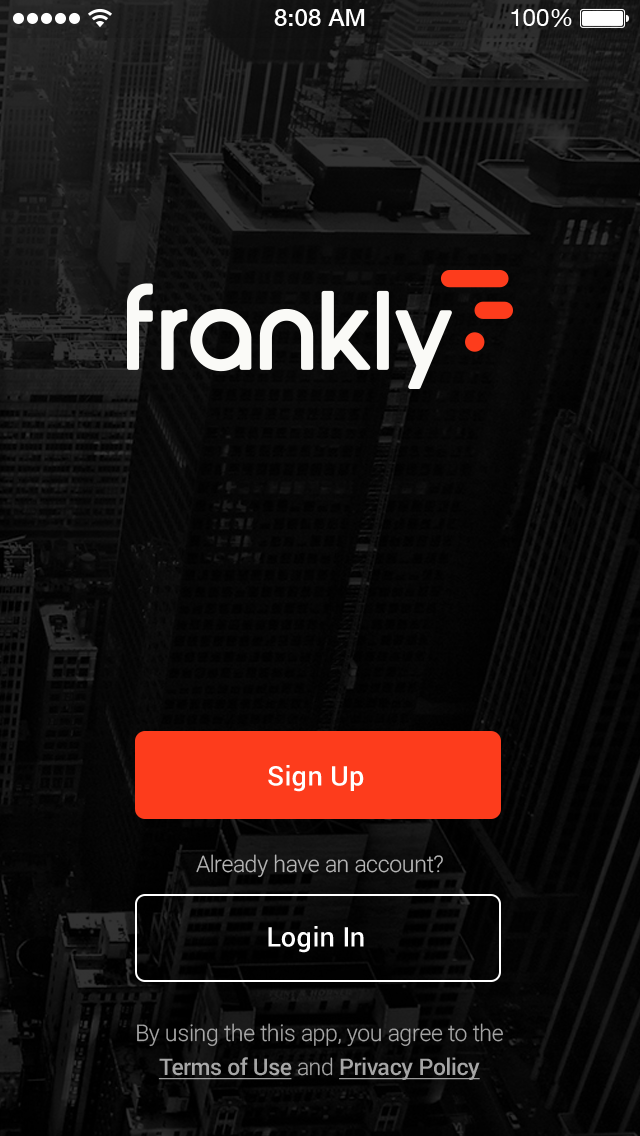
HIGH FIDELITY CORE FLOW
I worked closely with my team to begin identifying customizable elements (such as color pallet, font options, splash screens, & naming conventions) that would work across devices and platforms, taking care to consider accessibility and readability issues. I tested font size and color
Working with a PM and a handful of engineers, I identified the basic elements of a functional chat app, which primarily included account/profile creation, room overview/creation, messaging (in and out of room), media upload, alerts, settings, and additional content screens (for brand info, stores, etc.).
As we were designing for both iOS and Android, I maintained as much continuity in each element, adhering to material design requirements in tandem.
Full experience vs a la carte
Our goal was to enable brands to connect with their audience in real-time, but not all brands came to us with the same needs. Some already had a working app, while others needed the whole kit and kaboodle. We designed our SDK to serve specific technical needs (e.g., account creation/profiles, chat, messaging) if they only needed a couple, but also worked with brands in creating an entire app experience.

RAPID CONCEPTING
WHAT COULD CHAT BE?
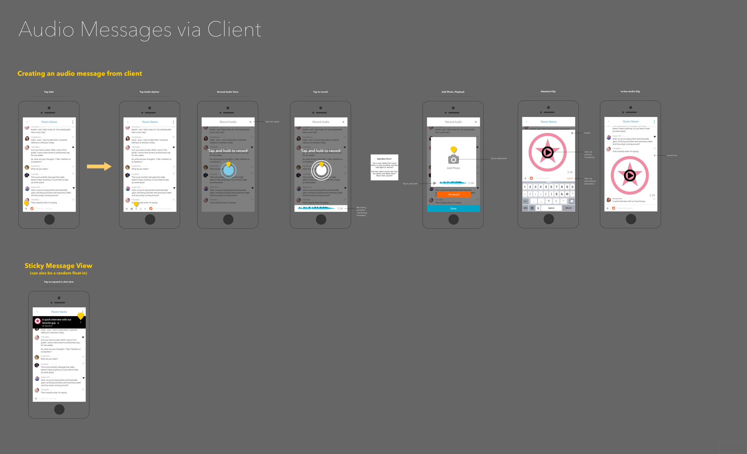
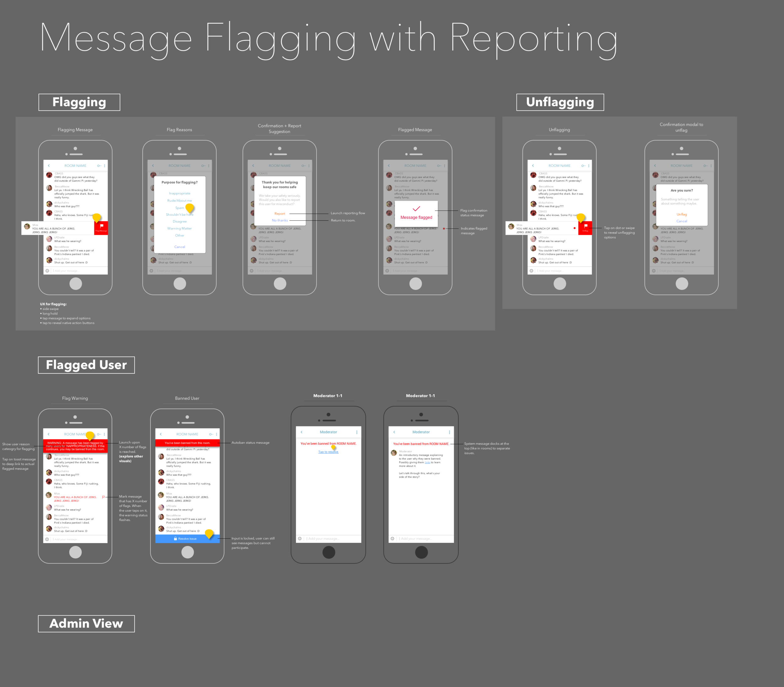
After our core features were determined, I wired over 100 additional concepts to be included in our partner road map, ranging from message flagging, to retail chat bots, to interactive polls/surveys, to content upload and link preview interactions, to secret messages between users and beyond. Anything a chat experience could include, I fleshed them out. Yes, there was a lot of caffeine involved.
At this stage in my process, I was using Axure to build these flows, uploading everything to Invision for my team to review. I had become extremely quick in rapid ideation for the chat experience - so much so that I could produce and upload around to 10-15 concepts a day, allowing us to pick and choose best fitting options for our partners, and to begin to see interactive patterns that could potentially be recycled for other features.
ADMIN PANEL
Alongside building out the user-facing designs, I began connecting our features to an admin backend for easy messaging, tracking, and reporting for our brand partners. We were limited with engineering resources, so I kept it to Bootstrap for quick and easy development.

STYLE GUIDES

INTERACTIVE PROTOTYPES
We had a lot of concepts that needed some visual guidance - though it takes a little time to create, a picture/animation says a thousand words when communicating design elements to engineering.

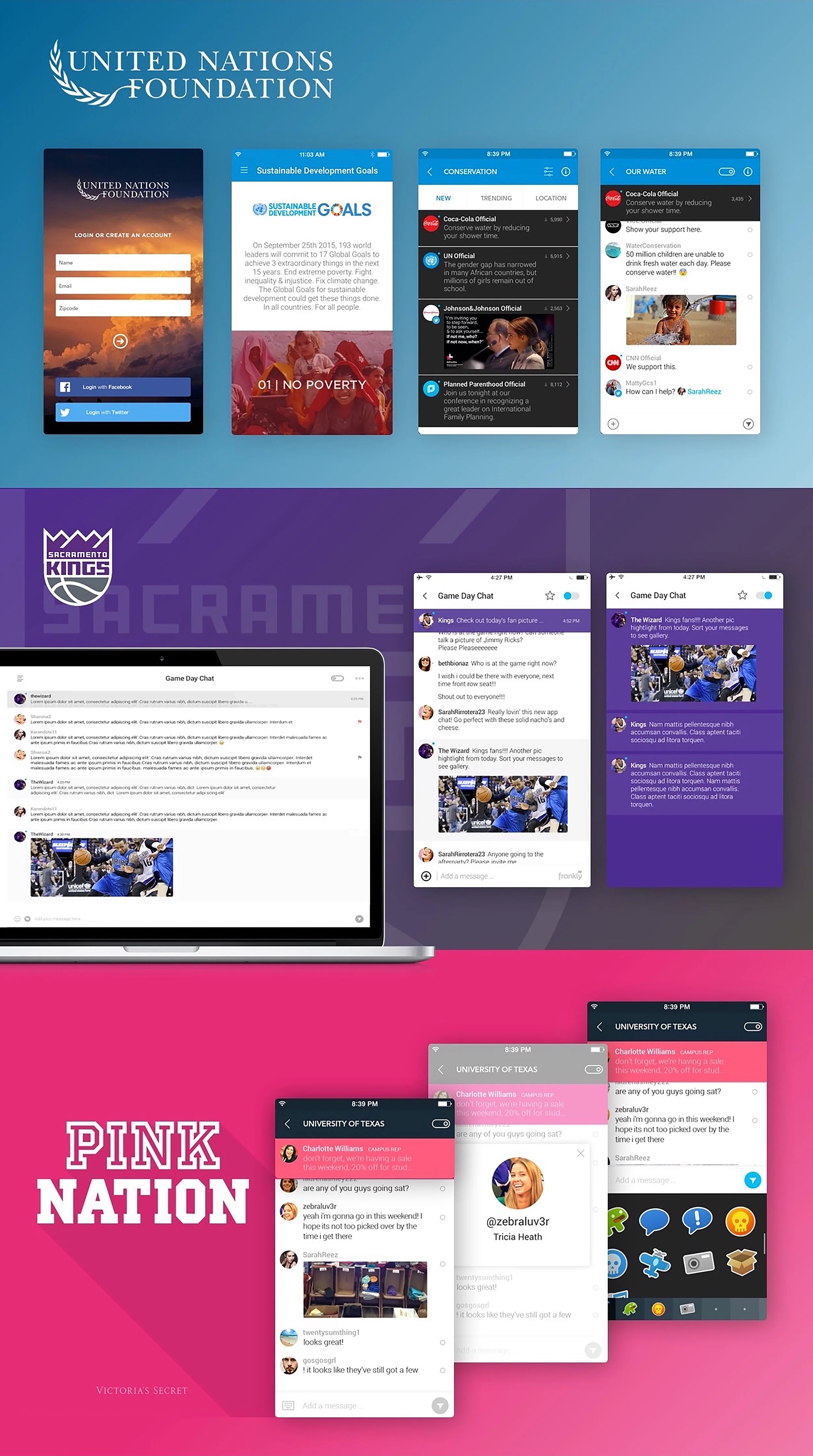
Implementing Into Brand Environments
RETAIL LABS
When a large retail company approached us asking how we could apply our chat technology to the retail market, a million ideas came to mind. After a good deal of bot research and several rounds of concepting, I realized our tech had so much more potential than traditional messaging applications.
Onboarding is one of my favorite things in the world. Elegant onboarding experiences are the butter to my bread, and hyper-personalized flows that lead the user to a field of dreams take the cake for me.
People pick up the phone and call somebody in place of using an online tool because they don't want to have to deal with having to sort through the mess in order to get to what they need. They would just prefer to ask the question and get an answer.
In the case of having a well-defined funnel (where, say, 90% of users have 3 specific questions/needs), chat's "if this, then that" logic can help create beautiful focus with an almost human-to-human interaction feel.
We designed a flow where exactly that can happen. The user is faced with 3 options, and the rest of the UI is revealed upon selection, allowing for a precise, no BS funnel, specific to the user's queries.

MAJOR TAKEAWAYS
Message technology can be a powerful tool, given the perfect storm of circumstances - the right audience, the right time, the right topic, etc. Given my experience researching and designing chat for a broad range of users, I've come so some key conclusions.
Chat tech can be deconstructed and applied to seemingly unrelated features and products.
When stripped down, an inbox or chat room is essentially a container for a chronological feed of action "nuggets" that can trigger other events, including notifications that can bring users back into the experience at will. If contextualized as a two-way command line and not just an inbox, you open up the potential to recycle code fro interesting real-time interactions.
A chat room is going to shrivel and die without triggers or reasons for strangers to interact.
Many companies are chomping at the bit for more UGC and fan/customer chatter around their brand. We learned pretty early on that the most successful chat experiences were planned, well marketed, and supported by active, interesting moderators. I created automated "ice breakers" and a docked messaging experience for the room's admin-level users to help keep conversation timely, in context and on topic.
Real-time communication has special design requirements.
Designing for the difference in audience size and messaging rate (fast, overlapping chat vs slow "forum-esque" messaging) includes time-sensitive animations/triggers and auto-refresh that can be taxing on a system. Building for high capacity scenarios is the messaging equivalent to smart scalability, and should be taken into consideration.
Chat bots can serve as an interesting alternative to itemized, action-based flows.
Things like preference learning, surveys (not quite the same thing!), search, purchase, and discovery each have if-then logic: "If I like/do this, then this happens, which gets me closer to a goal". Offering only one thing for the user to focus on completing at a time eliminates distraction and is more engaging when offered relevent feedback in a timely manner. Within a chat framework, you can also eliminate frivolous UI that only serves to give creative context to a prompt - it's just text, buttons, and preview states.
People log information from real-time interactions, so why don't most messaging systems bucket, tag and provide search options to support this natural behavior?
When you create a space for interactions to occur in real-time, users will mentally bookmark shared media/information with that space. Designing an experience to support their wanting to go back to grab or reference that material provides and advantage over other products that don't.


![[Guide]-Web-Client---Connectivity-Snacks.png](https://images.squarespace-cdn.com/content/v1/597fbd3f29687ff3c187306e/1516845493072-63JD64C8TXE3DAZPRQSO/%5BGuide%5D-Web-Client---Connectivity-Snacks.png)
![[Guide] Web Client - Inline Message Failure.png](https://images.squarespace-cdn.com/content/v1/597fbd3f29687ff3c187306e/1516845573070-SPLULH2S5HPOH7UI0FL4/%5BGuide%5D+Web+Client+-+Inline+Message+Failure.png)

