Frankly News PUBLISHER
This project presents several challenges my team and I have tackled while designing for news readership and publishing, cherry picking various stages of the product's lifecycle. If you would like to get a more detailed look into my research methodologies that supported my design thinking, take a gander at my R&D Systems case study.
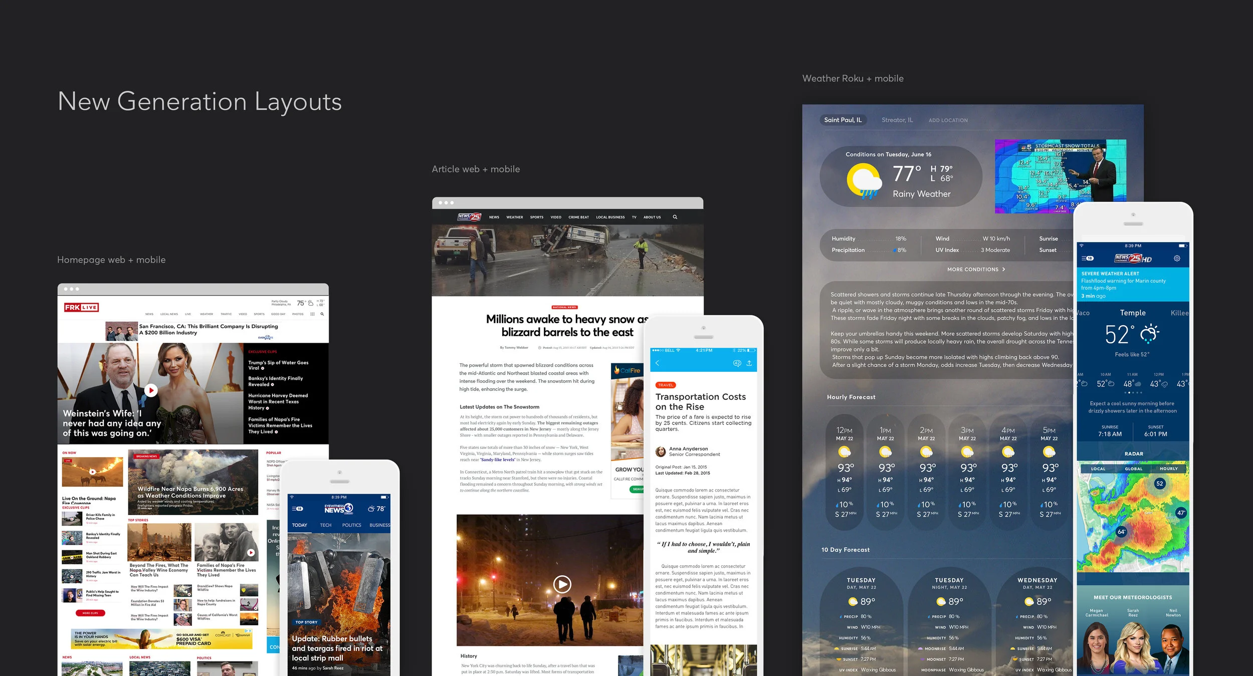
OVERVIEW
Frankly empowers hundreds of local news stations to reach millions of users through our Publisher platform, covering web, mobile, and OTT properties. Stuck in an elevator with inquiring folks, I would say "we're a Squarespace for local news stations" - a CMS with the newsroom in mind. Our objective is to help bring local news stations up to date with elegant digital solutions backed by user research.
Over the course of several months, I lead our UX initiatives, spearheading requirement gathering, product concepting, interaction design, and research + testing.
Our web designs will be launching in the next couple months, but if you would like to see our apps in action, head over to our iOS and android builds.
FEATURED GOALS


GOAL #1
HOW CAN WE DESIGN A BETTER PUBLISHING EXPERIENCE?
The original Frankly publisher had been built some years ago, and like most aging tools, it had some room for improvement.
I spent a couple weeks meeting with our client services team and a few stations' target users to get a sense of typical workflows, potential pain-points, and how our current producer was working out for them.
Research showed:
The workflows were a ubiquitous pain-point
The current approach to layout was inflexible
Crafting media-rich stories wasn't very well supported
Keeping a finger on the pulse of their content was extremely difficult, if not impossible
BETTER PUBLISHING: 1
KNOW WHO IS PUBLISHING
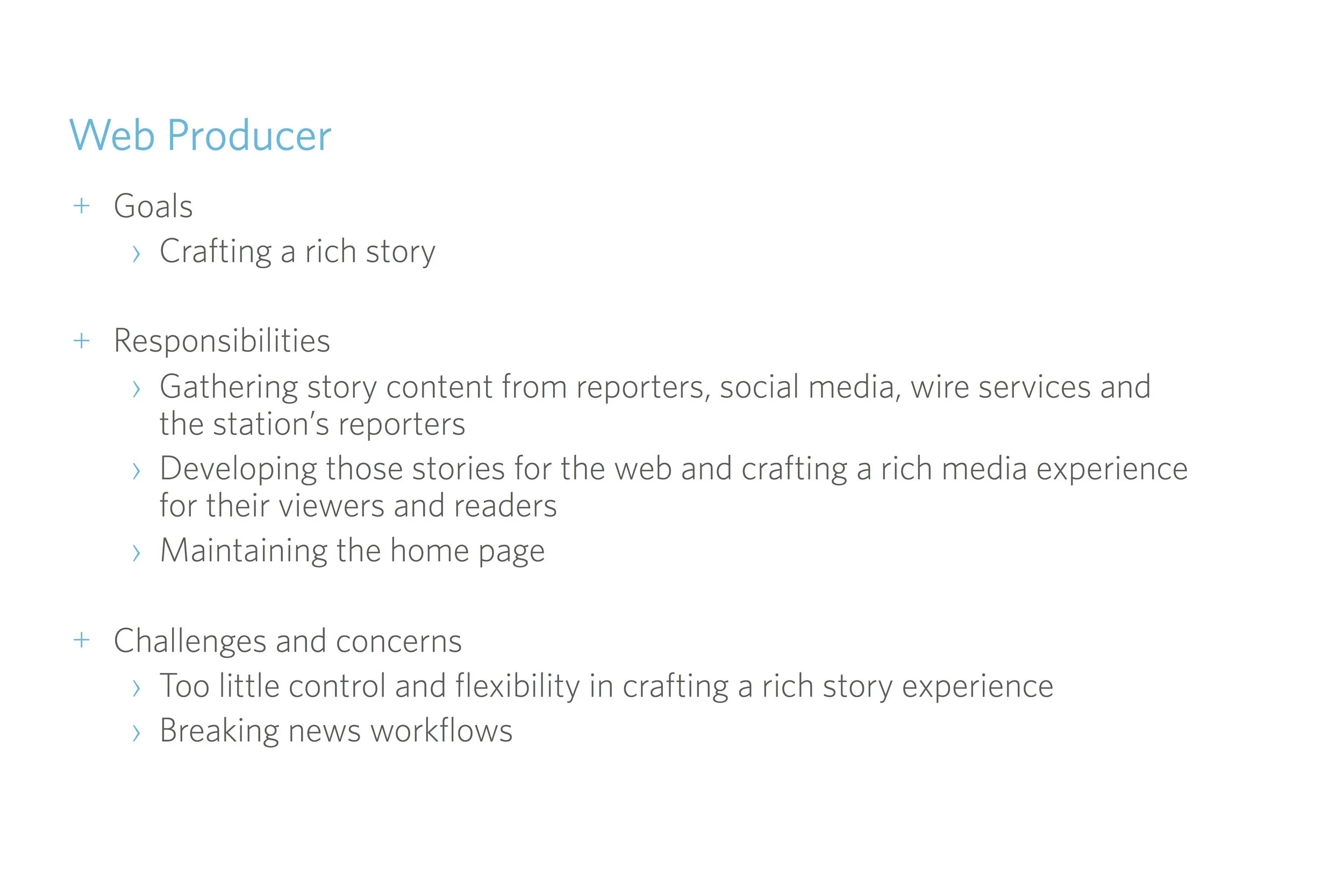
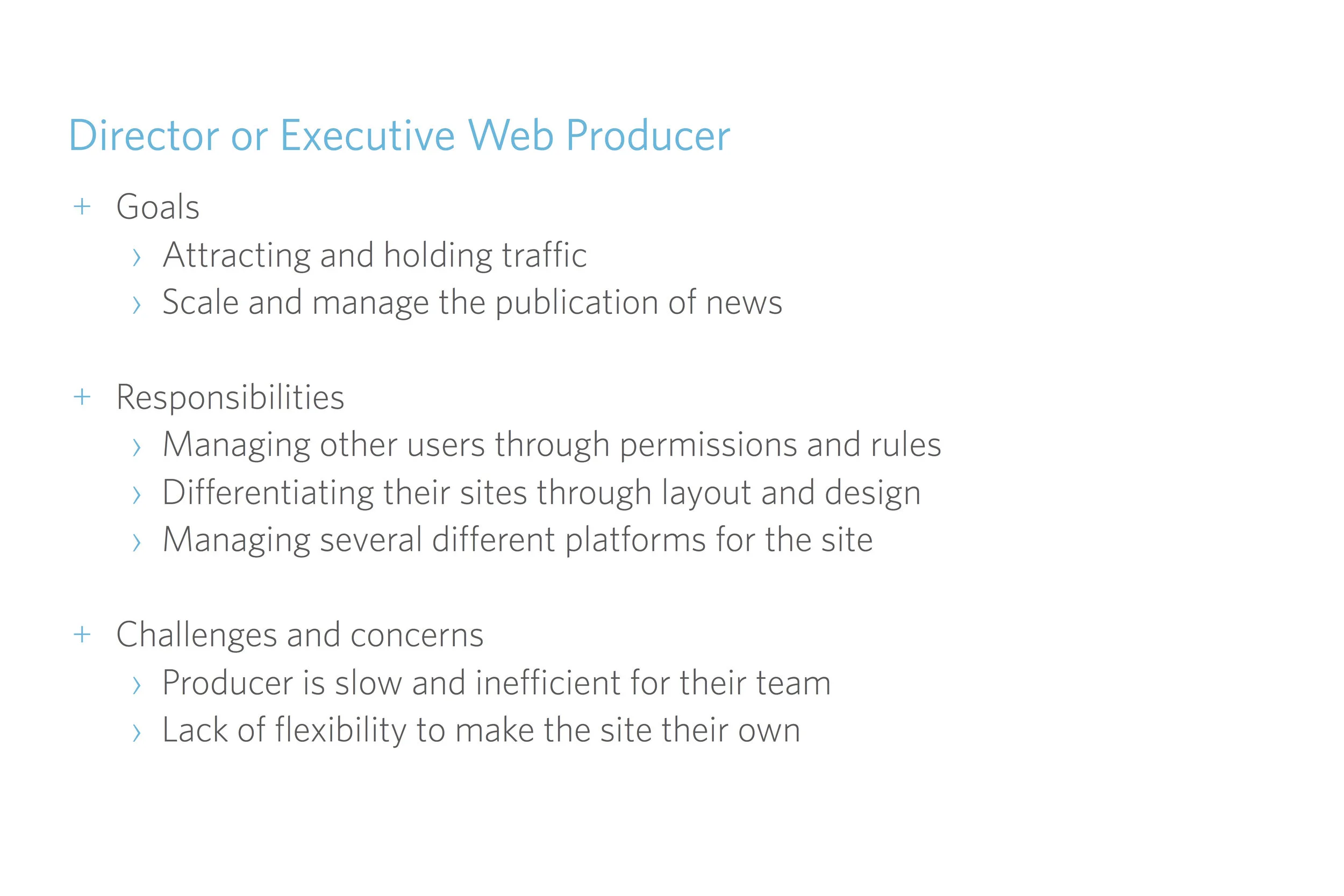
Understanding who we're working with and WHAT it is they're trying to do is the first step in making users' lives easier. In the case of news publishing, one person can wear many hats. We identified our users' underlying goals, their main responsibilities, top challenges and concerns with their current publishing experience, and the patterns of overlay that may occur between each of them them.


BETTER PUBLISHING: 2
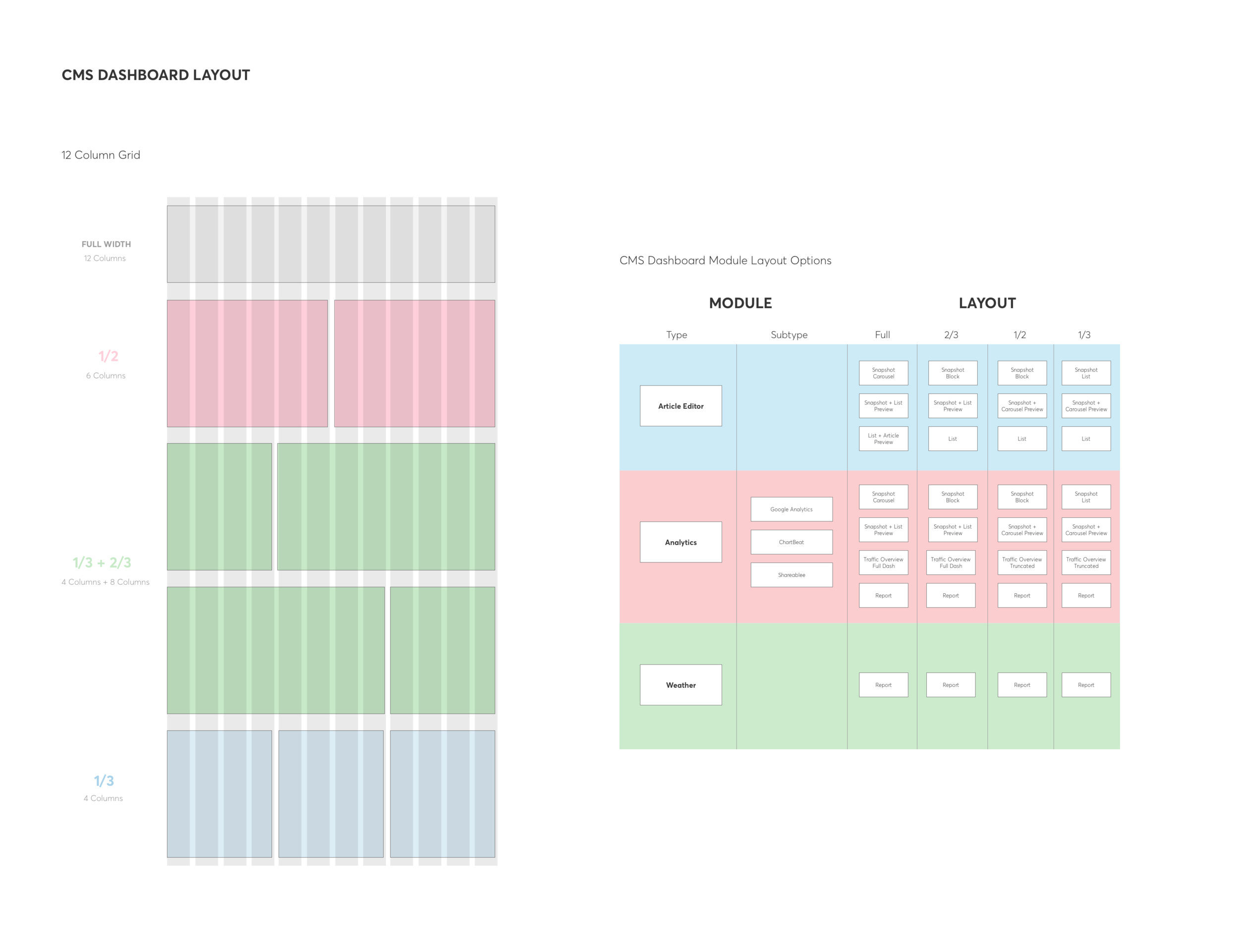
THE DASHBOARD
One of the first projects we wanted to tackle was the concept of a dashboard - our default page in the Producer was a simple search bar and a whole lot of empty real estate we were not taking advantage of. I wanted to make something that could be used as a "home base" for the user, and possibly a newsroom display, keeping everybody up to date with the station's performance.
As I mentioned, our users tended to wear many hats, and we'd identified "inflexibility" to be a major pain point for them, so it became pretty clear a customizable solution (where the user could create their own layout) was the best solution for us. Not to mention, this would give us the opportunity to see how users preferred to visualize their control center. Any opportunity to see how people prefer to organize their tools is a great thing.
Ultimately, I wanted to make sure we provided the user with an overview of the things that matter to them through the day, bring all of their most common tasks to the front of their experience, and promote cross-collaboration within the newsroom.
I began sketching out what a modular dashboard could look like for the top three users at the station: the Digital Producer, the Reporter, and the Meteorologist. I identified the top task flows they performed daily and tried to streamline that process for them (e.g., pulling in a "quick draft" option; highlighting story creation CTAs big, bold, and at the top; responding to social, etc.).
Asana has always been my favorite PM tool - I love how they break down their tasks by date and importance and call out project status and ownership by simple use of color. I applied a few of my favorite patterns to my content tracking modules, and I think it fit exceptionally well.
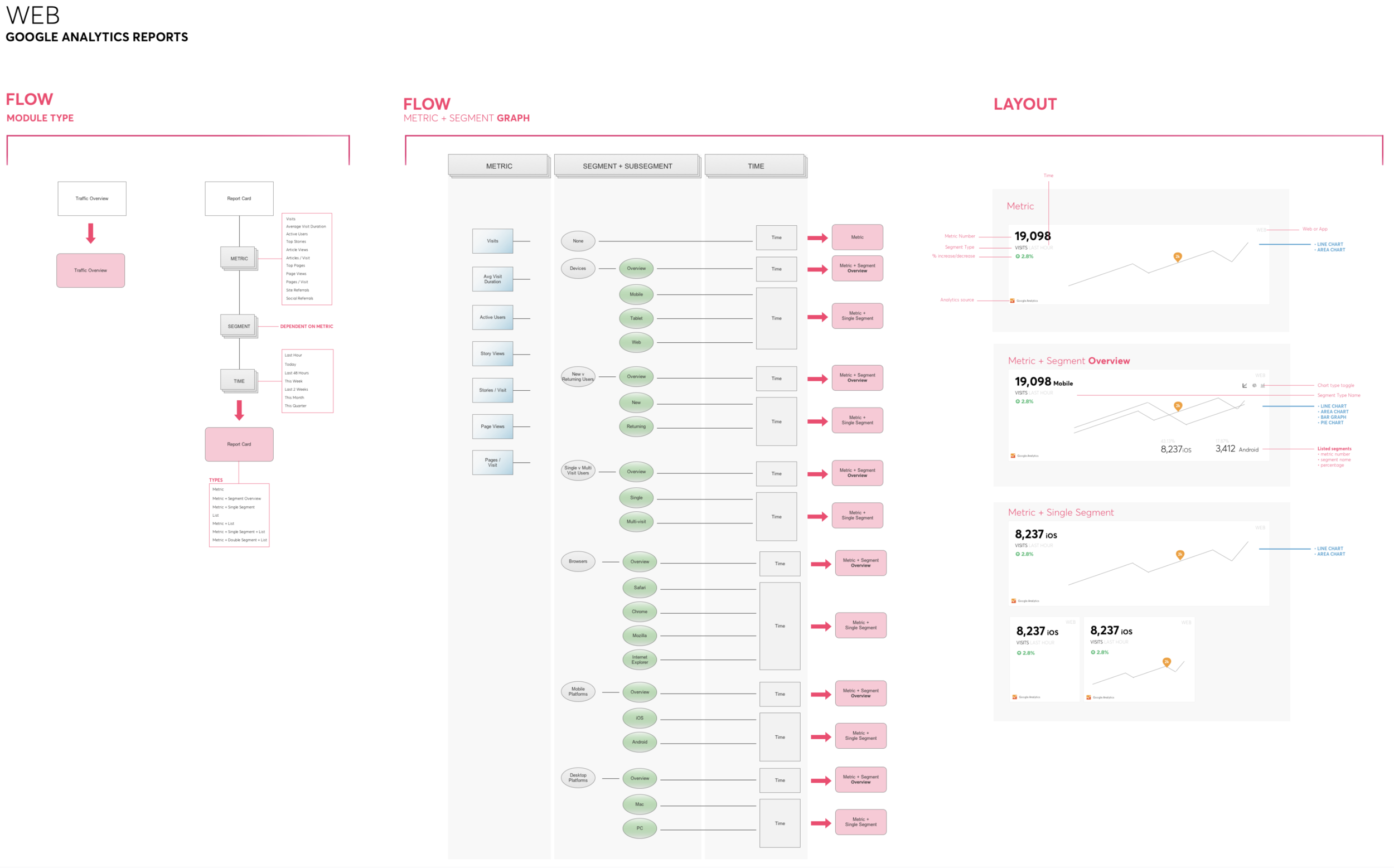
Analytics were a whole different beast. As you may know, there are close to a million variables one can track on Google Analytics alone. Add other third party integrations, like Chartbeat etc., and you have a gillion (a very scientific number). Most people are not analytics gurus. In our case, it was pretty touch and go if a DP had any kind of mastery over their analytics, but what was definitely certain was they all knew in "human" terms what numbers were important to them, and that it would help their workflow if they didn't have to constantly sign into each of their analytics accounts and parse out that important data.
I sat down with a few folks on our client services team and got a sense of the most important analytics for our customers. I then created a diagram breaking down each by metric, segment, module type, and product type, and connected each to module UI for easy design requirement communication.
At this point in our PRD, we were only just starting to discuss going modular with our designs, and this was a great opportunity to start exploring what that could look like across the Frankly platform. I began defining our CMS module library by type against a 12 column spread, testing visual harmony within full page mocks, as well as elemental configs across various breakpoints.


Now that we had our modules fully defined, it was time to explore the drag-and-drop interaction.
Chunking tasks into small, easily achievable units that progress toward a larger completion state takes the cognitive load off of the user and places it onto the tool they are using.
That in mind, I wanted the flow to first start with "I want this thing", which progresses to "I want this TYPE of thing", followed by "I want this TYPE of thing HERE like THIS", making sure to keep their options limited to a scale that isn't overwhelming per each unit.
We worked closely with our development team to get a working prototype going. We were able to iterate quickly by having a something to play around with as we went along. You'll notice, for example, the drop targets are a bit off. Details like that helped us start ticketing the project as we worked toward final designs.


BETTER PUBLISHING: 3
INTUITIVE STORY CREATION
About 90% of our CMS's usage was with article creation, but the current tools we provided our users made it difficult for them to intuitively craft a rich media story. By cleaning up our current solution, every single product line benefitted by enabling our users to quickly and seamlessly utilize our rich media functionality.
They were faced with a long list of fields to input their content, governed by fairly unintuitive "rules" connected to tag lists for layout display. They didn't have any preview state for easy visualization or the ability to format their interstitial media. The whole system was a bit off.
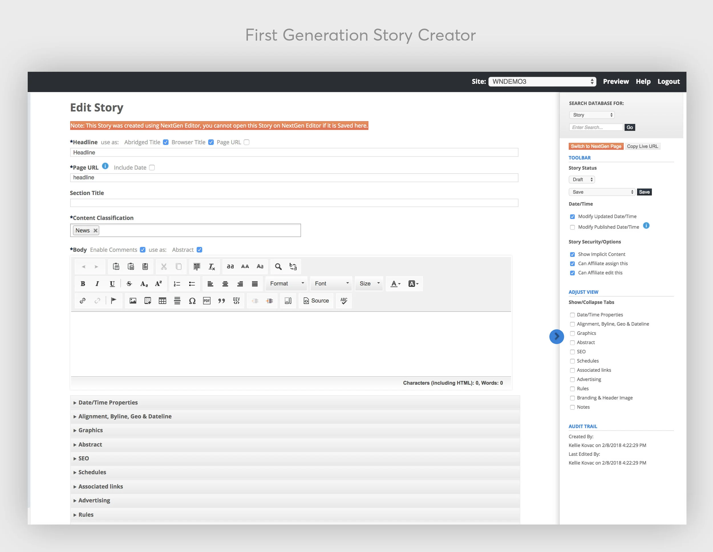
We used the same drag and drop functionality we were building for the Dashboard for the Article Creator, making sure to keep navigation and interaction elements the same across both. I designed the new editor to allow users to be able to write seamlessly and in a previewed state so they could see how the article would look in real time. I also included a more robust media library for writers to access photos/videos, top stories within the system (and keyword lookup), a quick view into what people are saying on social (draggable into the story), and the ability for them to create cleaner, more engaging galleries/slideshows.
BETTER PUBLISHING: 3
FIELD REPORTING
While working on the Article Creator and Dashboard, I was learning about the role of the MMJ (Multimedia Journalist). Often times they are out in the field, grabbing any photos/video they can, jotting down notes, and sending them over for the Digital Producer to edit and publish. Sometimes, if they are trusted enough, they publish directly, skipping the DP altogether.
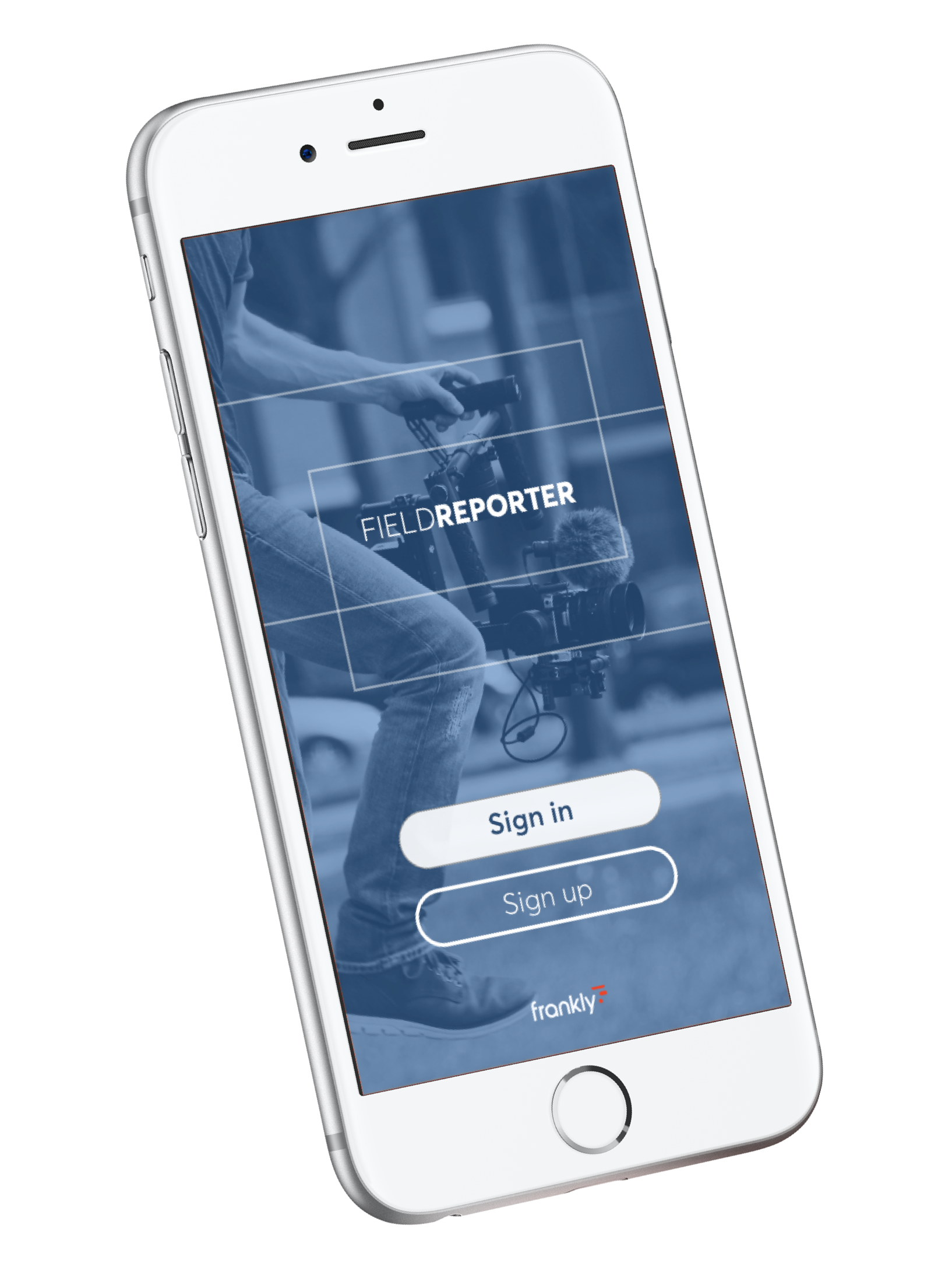
Our current solution was web-based and very difficult to create and manage a multi-media article from the field. That in mind, I designed an app experience (integrating our chat technology from the previous year) geared toward making the MMJ's life much, much easier.
GOAL #2
HOW CAN WE DESIGN A SYSTEM FOR MULTI-DEVICE PUBLISHING?
Research showed visible trends in news consumer preferences across web, mobile, and OTT. As a "one stop shop" for publishers, we were tasked to explore a design system that could cover multiple devices under one account.
The design team came together to identify best practices and common high-engagement flows across each front-end experience. We tackled backend for the station separately but in tandem with our front-facing consumer products.
MULTI-DEVICE PUBLISHING: 1
MODULAR THINKING
It became clear to us that in order to easily push the content from the CMS into clean, device appropriate designs across multiple breakpoints, and to allow our customers to manage their layout within a intuitive drag-and-drop framework, we needed to create a modular design system where we would do all of the heavy lifting on the backend.
Whenever we come across a major feature overhaul, our design team has found the best way to break the project seal is to hole up in a room full of white boards and do a whole lot of sketching and mapping, playing with logic and interaction options, and on the occasion, bringing in an engineer or two to check our work against our current platform and resources.
As you may know, in the case of modular design, there is a ton of math involved. Simple math, but enough to trip up the workflow if even the smallest variable is off. We chose to class our elements in t-shirt size units, applying breakpoint requirements to each. This made it easy for us determine, systemize, and maintain content block configurations without having to worry about throwing our designs off with human math error.

A quick reference guide for module size allowance.
We spent time creating a module library within sketch for easy drag-and-drop wireframing. Since we already determined the breakpoints within the symbol library, and made sure they would scale appropriately while being resized, we were able to build a system that allowed for pretty hi-fidelity mocks that we could create within minutes.
GOAL #3
HOW CAN WE INCREASE ENGAGEMENT?
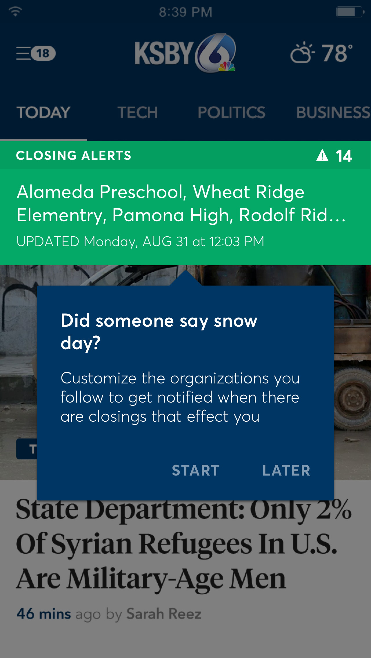
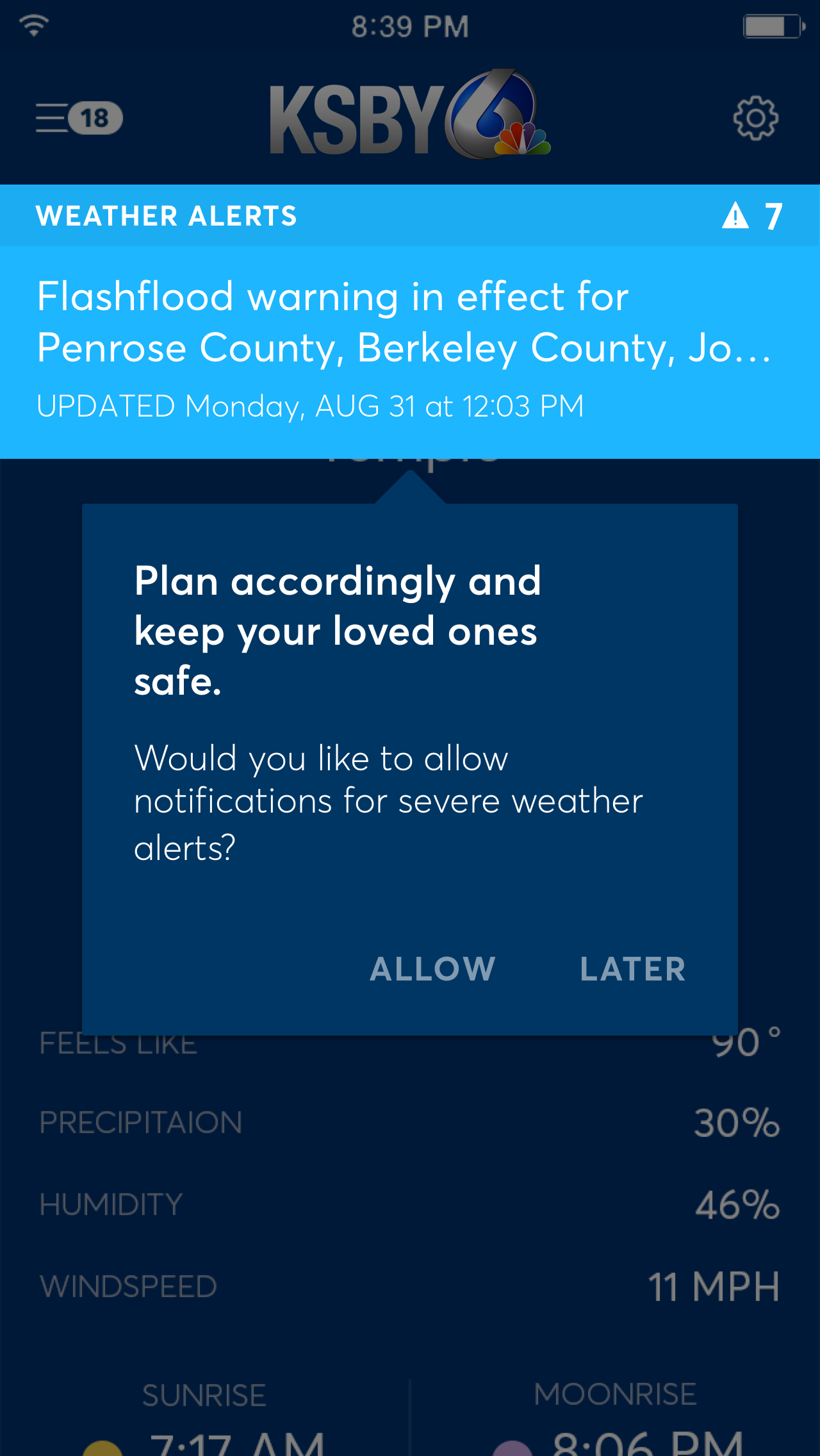
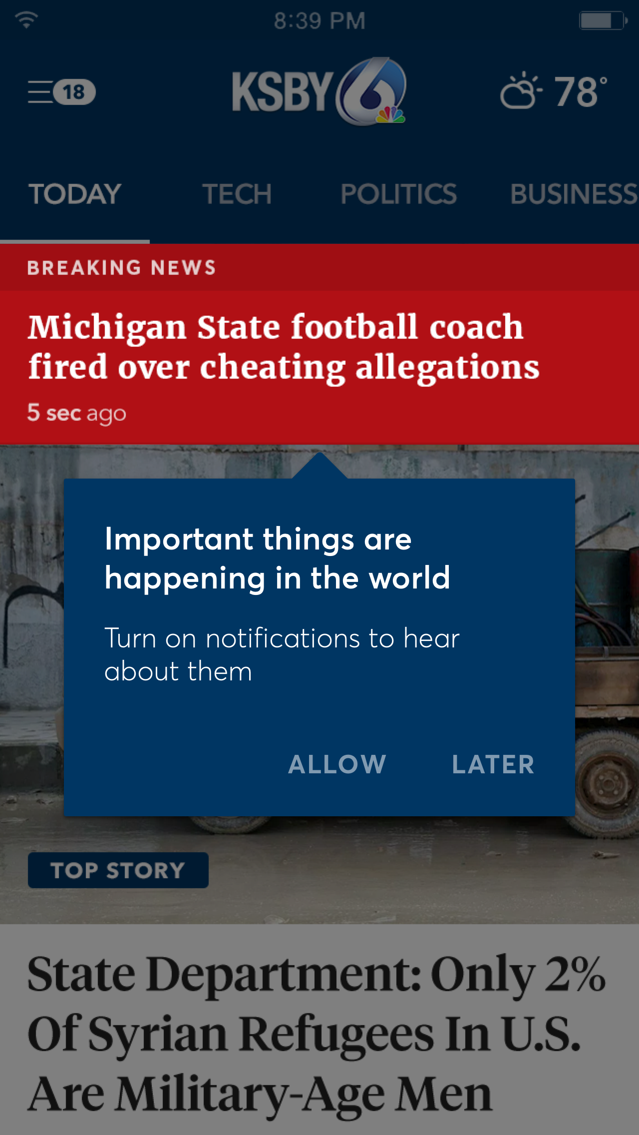
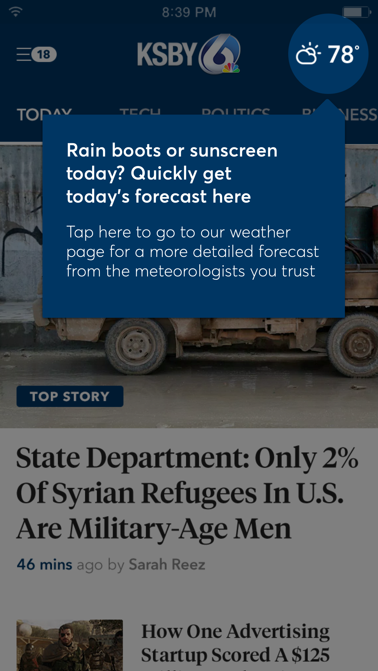
This is the number one question we receive from our clients. Before diving into designs, I held several interview/task sessions to get a sense of what piques users interests to go "deeper", to return more frequently, to share what they read, to download native versions of the material, and to opt into notifications to bring them back in with push.
Over the following months, we explored solutions to what we learned.
INCREASE ENGAGEMENT: 1
DESIGNING FOR BETTER NAVIGATION
The most important problem to tackle for me is always "how to use and navigate" a product. I spent time with multiple users watching them interact with their favorite news apps and sites, getting a sense of how they mind map various IA types across different devices, and grabbed analytics from our news client's common categories/pages to be sure to serve up most frequented content.
During our testing periods, I prompted users to complete typical tasks to make sure our interaction choices were inline with their behavior, tweaking further iterations to improve our designs.


Another quick test for mobile navigation I find comes in handy is the thumb zone overlay. As screen sizes have begun to enlarge, most of the top navigational behaviors (such as tapping and swiping between categories) have found themselves in the "ouch" zone, prompting users to prefer comfortably scrolling for discovery over having to make the reach.

This in mind, we took care to allow for category swiping to exist along the length of the screen rather than just the top, include a "top stories" section at first load to allow for category scan upon scrolling, and kept the highest converting "tap zones" for article view within the most reachable areas of the screen.
My research also showed that a user is far more likely to scroll before swipe at first action. When tasked to find a category they were interested in, 80% scrolled the main page first before recognizing the top nav category slider. Placing "category shortcuts" on the main screen supported this behavior and increased task conversion. Docking the shortcut bar upon scroll allowed for users to keep the particular category in mind while browsing.
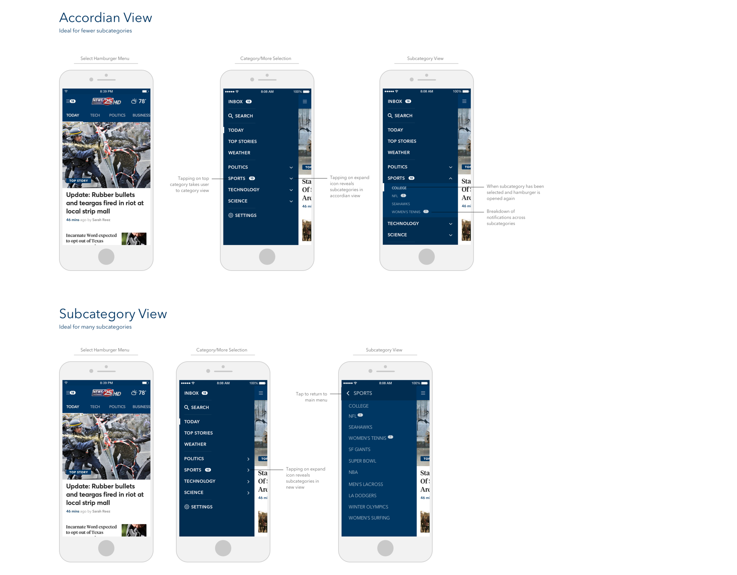
In the case of subcategories, they were too hidden in our apps. When I say "hidden" in this case, I mean the user had to do too much work to get to them, and once they were presented, they were presented far too much like the main navigation to be recognized as a new nav type.
In the frames below, I moved them into the hamburger menu, noting newness by a numbered pill. I explored two interaction types to accommodate for variations in amount size.
INCREASE ENGAGEMENT: 2
ELEGANT ONBOARDING
Before a user jumps into your app, it's always beneficial to give a quick rundown of what to expect and how it will bring value to them. Having users fill out preferences at the get-go also has some great benefits. First of all, they won't have to search for ways to make the tool better for them, they can hit a couple buttons and boom - launch into an experience that works how it should. It's also an awesome tool for RESEARCH. Haha. Get it where you can!

INCREASE ENGAGEMENT: 3
TEACHING INTERACTION
In times when features are a bit hidden or the product takes a little time getting the hang of, tool tips are always a handy onboarding option. It's important, however, that they are to the point and dismissible. They are also a wonderful opportunity for brand voice. Funny and quirky tips have always been my personal favorite. We didn't have the option in this case, seeing as most news stations want to be taken seriously, but even the "just informative" kind helps the user get a sense of the product quickly. The sooner they know how to drive the car, the more drive time you're gonna get.
INCREASE ENGAGEMENT: 4
CLEANING UP MOST VISITED PAGES
Intersecting analytics with client requests, we identified the most important pages necessary to fulfill our redesign MVP. Aside from the homepage, article pages and weather had the most traffic.

Some elements I "cleaned up" for better performance:
- Created more white space to give the content breathing room
- Selected fonts/sizes/colors that are easy to read and look more up to date
- Parsed down the color pallet to promote better scanning, image/text anchoring, and CTA conversions
- Applied more full-width layouts and responsiveness between content modules
- Designed "mobile first" with more native appearing elements to increase conversions
- Fixed page load issues by optimizing photo/ad calls (Spark Articles)
- Integrated better related article layouts
- Updated navigation (see above)
INCREASE ENGAGEMENT: 5
MAKING ADS LESS OF A BLOCKER
Ads are a necessary evil. Nobody likes them, but the vast majority of our users report they don't mind them when 1) they don't get in the way of their tasks, 2) if they're relevant to what they're reading, and 3) if they aren't a "distraction".
Some ways I eliminated distraction while keeping in line with revenue requirements:
- Many sites placed too tall ad units above the content that would load slowly and cause the content to go down, pushing much of it below the fold. Making sure stations understood this made for a bad experience was key.
- Docked high value ads in rails that loaded new ads while users scrolled, which proved to be less interruptive than peppering them throughout the site.
- Placing ads in natural breaks of the layout, creating a seam-lined effect.
- Eliminated jarring movement within the ads or possibility of repetition of the same ad across the page (the latter has color blocking effect that breaks the visual flow of the content)
- Created novel ad display interactions so users felt "delighted" by the interaction rather than annoyed that it was in their way.

Some users actually reported they liked "fun" and "entertaining" ads. We explored a peek-a-boo concept to make the ad experience feel more novel on mobile, which was a favorite across our customer base.
INCREASE ENGAGEMENT: 5
Spotlight: REIMAGINING THE "STORY"
In the case of news, most sites/apps (including ours, initially) have an IA map that looks a little like this.

Familiar, isn't it? The trouble with this IA is the content silo it creates. Once a user opens an article, the only way to allow them to go deeper is to present interstitial recommended links (which are higher performing, but oftentimes unrelated or disruptive) or a "read similar stories" section to the side of the article (in their blind spot) or directly underneath the article (frequently associated with sponsored material, triggering an "end of article" response, which kills continued reading impulses). Analytics also showed me that users very rarely go to a category page unless they can't find what they are looking for. They simply don't use them to "browse" and "discover". After they read the story, that's it. They're gone, off to something else.
How can we break that silo? Additionally, how can we capitalize on a user's initial interest by bringing them BACK into a related material after they've left?
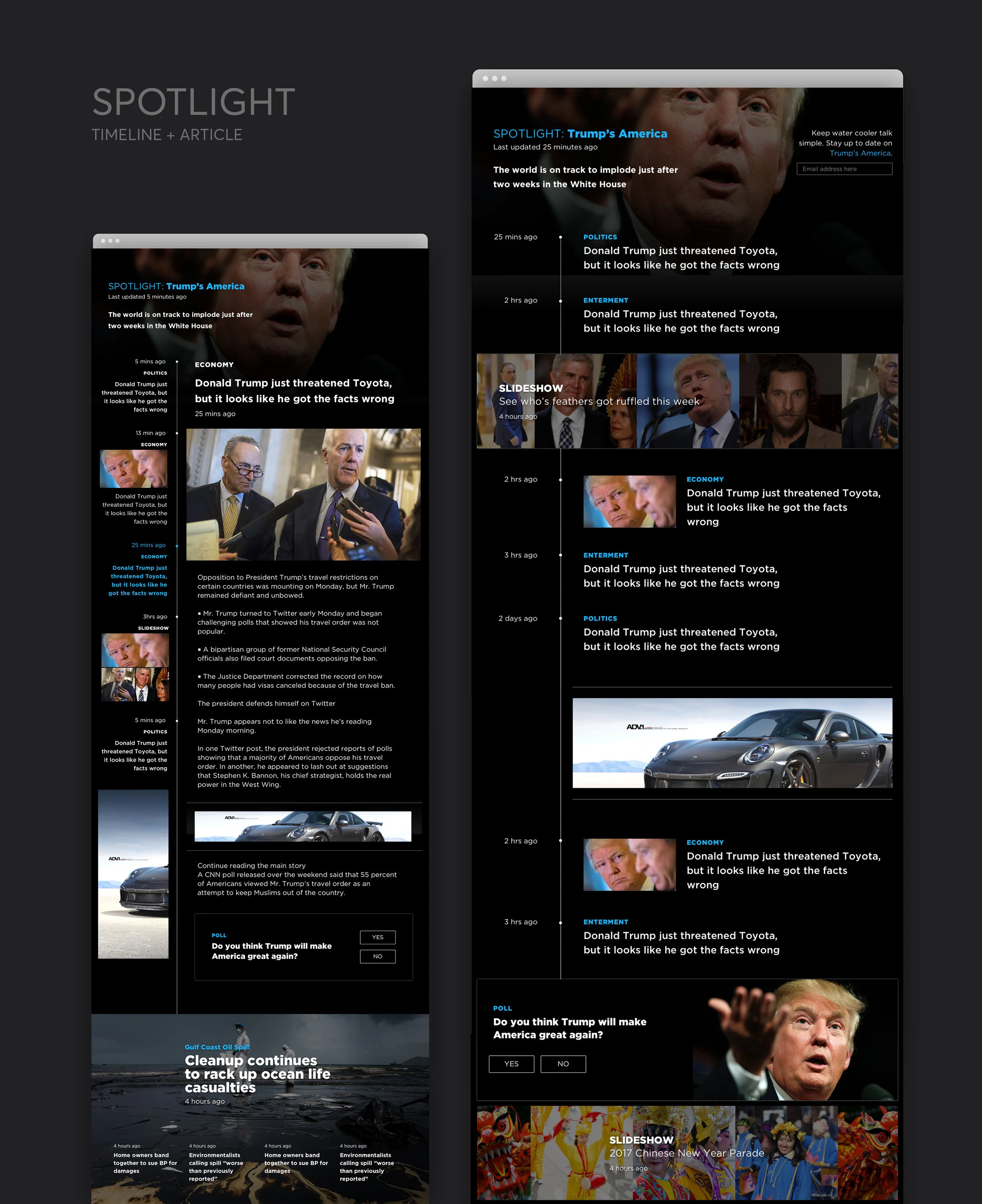
I first sat with several reporters and digital producers and learned all about their "sweeps weeks" - the periods of time they feel double the pressure to increase engagement to fulfill their local ad quotas. This was an interesting topic to me because it tapped me into their strategies that got them through with higher numbers (dark patterns aside). Across the board their best tactic was creating what I coined to be a "Spotlight" story - a collection of smaller stories that fed into a larger umbrella "hot topic" event, following up as it unfolded and supplying deeper think pieces to give it greater context. The tools they had weren't sufficient for their aim, and I wanted to give them something streamlined that could achieve their engagement goals.
I quickly drew up some hypothetical benefits and product logic to communicate and determine potential fit in our current product roadmap.

WIREFRAMING & CONCEPT VALIDATION
I came up with some potential Spotlights I could use to validate the concept, and during some of my user testing sessions, explored how users tend find, read, and go deeper into a topic of interest.
Keeping to our new modular approach for content layout, I mocked some early concepts to relay to the team, showing how a Spotlight can easily be injected a station's layout within our system, as well as native sponsorship opportunities (invisible, valuable advertising is the best advertising).

Ultimately, Spotlight has allowed for our team to think outside of the box in terms of news readership flows, and has been pushed into production to test within our largest client's station network (serving a few million readers). We expect for it to increase engagement tremendously by serving "smart collections" to readers, as well as see a growth in newsletter signups and notification opt-ins.