Maps.com Redesign
CHALLENGE
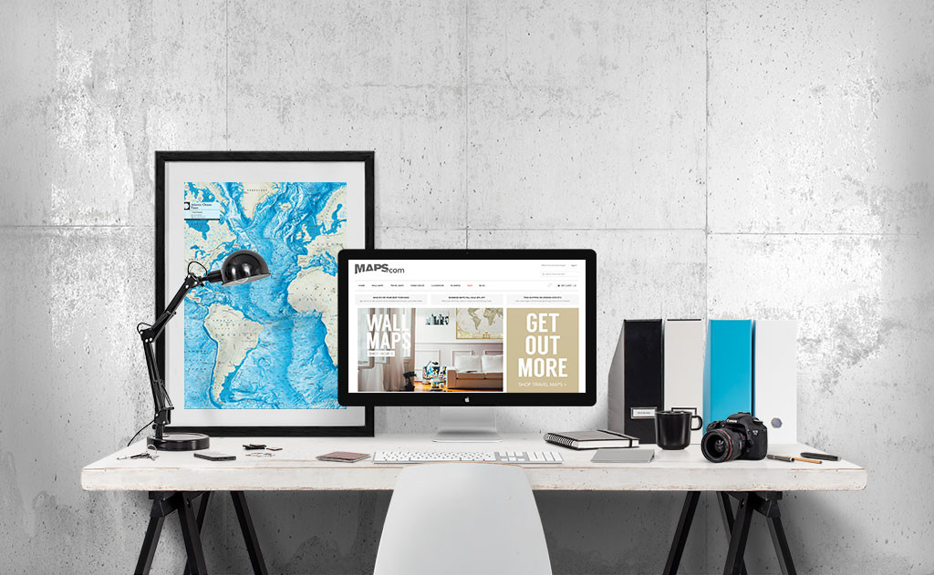
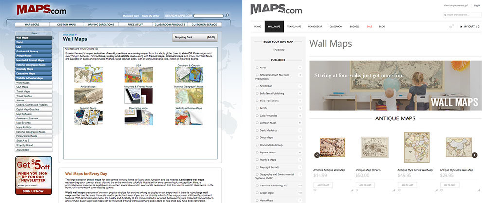
Maps.com wanted a new e-commerce website and backend system to replace their aging solution. The goal of this project was to reorganize the website’s front/backend to reflect a cleaner, navigable, and more user-centered design to free up the overextended eCommerce team while simultaneously increasing conversions.
MY ROLE
I lead the design team and spearheaded UX initiatives, during which I researched and designed customer personas and user flows, constructed the information architecture, established a more automated and intuitive customer service and fulfillment process, and built/trained them on the Magento Enterprise platform. I worked with the marketing and development teams to strategize, structure, and execute designs and interactions to maintain a new Maps.com brand and adhere to their evolving business objectives.
DELIVERABLES
Established a repeatable user testing/documentation system to bring the team up to UCD standards.
Clarified user flows based on analytics + personas, optimized product photography, and integrated upsell widgets – reducing number of clicks, leading to an decrease in bounce rate and increase in conversions.
Enforced “3 clicks to purchase” by reorganizing the IA and optimizing design (navigation, category pages, product tagging, quick cart, etc.)
Optimized A/B testing by reorganizing the layout of the site into a more modular design.
Redesigned brand and language standards and automated various touch points during the post-purchasing process to decrease product return rates and customer service calls.
Designed and integrated a new “build your own map” tool for existing and newly discovered market channels.
DEFINING THE PROJECT
I began by interviewing key stakeholders, customer service reps, and the marketing/sales teams to get a collection of loose customer persona characteristics to play against current analytics.
I created customer surveys, read through product reviews, and worked with marketing to establish strong lines of revenue, product popularity and repeat sale potential to bring clarity to our most important revenue funnels.
We discovered four strong customer personas that had been loosely tested with flash stores and email campaigns over the holiday season, and began to flesh out their preferences and behaviors, focusing largely on those parsed out analytics.
PERSONA DEVELOPMENT
Whiteboards are great, especially when they’re portable. How I typically like to group things is to first gather ALL of the data into one spot until we are exhausted of gathering and find that things are beginning to become repetitive. From there, it’s a matter of sorting based on characteristics that are most likely to least (e.g., the 80-20 rule), and voting on what we agree is most important for both user and our company’s own objectives.
One way I like to hold team voting is the Dot Exercise. This can be used for determining hierarchy of user requirements, and in this case, persona characteristics. Each team member is given a set of dots that hold various weight (e.g., greater significance if it’s the director of marketing vs a sales rep), which they place next to characteristics (or requirements) they believe hold the most importance. This gives everybody an opportunity to brainstorm the TYPES of data we should be analyzing, that way our analytics and user research have a little direction before plummeting ourselves into a that dreaded quagmire of statistics and potential survey questions.
Fleshing out these personas and supporting them with hard data changed the direction we believed the brand should go. It also helped us visualize future product merchandising and grouping, particularly in communicating to the e-commerce team what types of future products would do well in our store.
USER JOURNEY MAPPING
After establishing four strong customer personas and connecting popular product to each, I held a company-wide customer journey mapping workshop. In the case of Maps.com, I separated the groups into four, one for each eCommerce persona (decorator, traveler, business owner, and educator). I made sure to include in each group those who have had the most hands on experience with each subset of customers to make sure mindsets were appropriately in line, and printed off persona sheets that included a common narrative and specific “knowns” for them to refer to and fill in.
PURPOSE
COGNITIVE WALKTHROUGHS ARE EXCELLENT INTERNAL COMPANY EXERCISES.
For the purpose of what I needed at this stage, it helped redirect the group’s focus from one of reactivity and product featuritis to that of helping users achieve higher goals. Holding full company user-focused workshops also helps mine experiences and information about our users from a variety of perspectives and encourages an open forum for discussion about interactions, frustrations, and solutions to roadblocks.
GOALS
Explore user testing requirements
Tap into persona triggers, goals, actions, thoughts, and feelings from company experts
Begin collecting information for task analysis
Encourage an empathy between the team and our customers
Promote stakeholder buy-in for future designs by offering a guided cognitive walkthrough of the current site structure
Identify pain points that likely limit conversion rates
Ideate solutions to fixing roadblocks
MOST HUMAN BEHAVIOR IS PROPELLED BY A DESIRE TO COMPLETE A GOAL.
Preceding the creation of a goal exists a trigger, be it a thought, event, emotional response, etc.. In the case of eCommerce, two parties are attempting to achieve individual goals (e,g., seller & buyer). The success of both largely lies in the seller’s ability to strike a balance between both journeys; a symbiosis where the experience they provide remains in line with the customer’s needs/wants. Logically, then, having a solid understanding of these cognitive journeys allows for the creation of a frictionless passage from trigger to goal, and in the world of eCommerce, that means more conversions. My journey maps are a collection of actions, thoughts, feelings, pain points, and potential opportunities placed on a timeline from trigger to goal (and beyond for repeat usage/purchase).
A USER’S GOAL NEVER ENDs AT “BUY X PRODUCT”
Their true goals are higher, more emotionally laden concepts to which goods or services help them get closer. They are things like "Feel better about my body" or "Make my child happy" or "Remind my wife how much I love her". Good UX should make them feel like they are on their way to achieving that.
That explained, I prompted the groups to develop a trigger and specific goal and let loose to attempt to achieve them using the Maps.com website, taking care to record their experiences on a table-sized journey chart.
DISCOVERIES THAT INFLUENCED OUR DESIGN:
Walking around the room, I was getting the impression that people were getting frustrated (as the user). At this point, we discussed the balance of frustration/anxiety vs relief/good feelings, and how they relate to continuing down a path that includes the services we provide as their solution or leaving for a better alternative. They were thus instructed to mark on the journey map the moment they naturally felt they would leave the site to find a solution elsewhere, and to mark on a scale of 1-10 where they were emotionally previous to that decision. Once they marked that hop-off point, they were prompted imagine a “perfect environment” that would help them get to where they needed to go, and to continue recording based on these ideas.
Nobody achieved their goals with our current solution.
Much of the frustration was in result of:
navigation structure
incorrect search results (tagging issues)
language choice
visual representation/persona affiliation
shopping cart issues.
Knowing these problems gave us excellent direction in prioritizing our energies in developing the new site, and help alert everyone of the specific frustrations our users have been dealing with over the years.
TASK & USER FLOWS
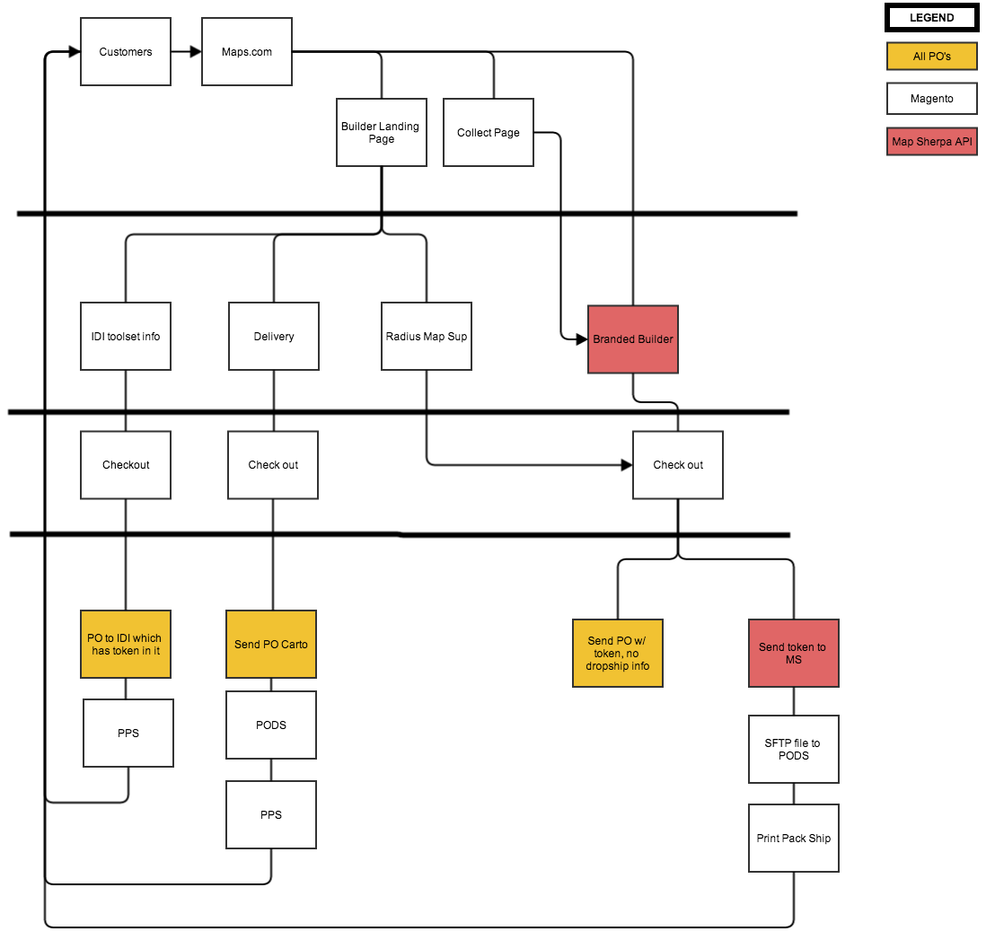
During this time I was in the midst of creating a company wiki in an effort to centralize our information. While interviewing the eCommerce team, I created a flow chart of the processes occurring AFTER the product order, and noted current touch points between the company and the user (e.g., tracking notifications, email follow ups, customer service calls, etc.).
Again, I find that brainstorming task flows on a giant whiteboard with post-its (representing touch points, pain points, automated/manual characteristics, etc.) to be the most effective so everybody can sign off on the flow quickly and visually. I can then take a photo and send to stakeholders for verification and reference, or run it through Gliffy for a more polished chart to present.
DISCOVERIES THAT INFLUENCED OUR DESIGN:
I recognized many unnecessary roadblocks and manual touch points that could easily be solved by a more powerful backend system. As we designed the website, I worked with IT, management and marketing to identify a cleaner solution. This largely involved system automation/communication, intuitive product tracking and email touches to help keep customers up to date with the progress of their order.
An additional issue was our return rate and calls to customer service. People were returning items simply because it was the “wrong size” for the wall. A disconnect that needed tending to was that we aren’t another Amazon, but rather a map house that prints and ships on site. We decided to make the order tracking process more ‘human’ in language, and align our brand to the romantic concept of a cartography studio. This, we hypothesize, will warn them indirectly that the process is expensive and time consuming, thus quelling their impatience.
We identified that people were calling customer service because:
They couldn’t find what they needed, calling the number instead because it was easier.
They had no idea when their order was going to arrive.
They became impatient and called to check on the status of their shipment.
We agreed that a more robust, human notification system after the point of purchase meant less calls, more repeat orders, and happier customers.
GUERRILLA UX
I took to the streets in an effort to identify user language and grouping preferences, offering free frappuccinos in exchange for 15 minutes of people's time.
UNVEILING THE IA PROBLEM
Maps.com has over 9k skews and their current product navigation was too broad on the homepage level. The existing IA was tangled and convoluted, resulting in user fatigue, higher bounce rates and extremely low conversion rates at below 1%.
Apart from design aesthetics and overall functionality, my initial hypothesis was they were suffering from:
Lack of persona funnels
Confusing terminology
Inappropriate & overcomplicated product grouping
BUILDING THE CARD SORTS
I created four separate card sorts via OptimalSort. Each sort included a bisected sample of 75% products, styles, and product identifiers they would most likely purchase/search for and 25% mixed bag from a group of vastly differing products & terms than what they would want/use. Each test took approximately 5-7 minutes.
I then went to where the fish were biting – some in Starbucks, others on the street, and even more around stores where I knew they would be shopping.
ANALYZING RESULTS
I created a series of dendrograms and association pyramids from the test results to take into consideration.
People didn’t know or care about any product brand names outside of National Geographic and Rand McNally. This helped me parse down the initial top navigation section, and alert marketing to what kind of brand campaigns to focus on.
9/10 asked what “wallzilla” meant. After describing the product, all of them came to the conclusion that it should be called a “sticky map”. In simply changing the terminology of “Wallzilla” to “Sticky Maps”, we have increased Wallzilla conversions 300%.
People grouped product types first and more specifically (e.g., wall maps, folded maps), and lumped all locations and location identified products (e.g., Texas, Texas wall map) into a single bucket labeled “places”, “travel”, or “location” UNLESS it was identified as “world” or “US”. This told me that unless somebody is searching for a specific location, they will most likely prefer to manually navigate products by type over location, OR they are most likely going to search for location in the search bar as it is something specific that is known (rather than browse).
Example of success:
In simply changing the terminology of “Wallzilla”, to “Sticky Maps”, we had increased Wallzilla product conversions 300%.
CREATING THE SITE MAP
With my research in tow, I held a team meeting with the marketing group to conduct a full site physical card sort to determine the site navigation once and for all. I found this to be effective since I knew there would be many items we’d want to do away with altogether. Coupled with a whiteboard to determine final grouping, we were able to come to a design for a user-centered site map, taking care, again, to focus on our persona funnels.
EARLY WIRE FRAMES
In today’s social web, it is imperative that e-commerce sites are designed around circulating content, whether that be new products, categories, or curated collections specific to certain customers. For these purposes, I typically choose modular designs so things can be switched out easily and regularly. In the case of Maps.com, this is exactly what I did.
My early wireframes reflect a three tier navigation for recall, recognition, and discovery. A search bar toward the top right (recall), a top persona-focused top nav (recognition), and a large array of content blocks for marketing and merchandising (discovery + brand awareness).
In this early phase of wireframing, I prefer print outs to bring to meetings. This way we can scribble all over them and I can go back to make the changes we discussed making. Easy peasy.
BLEEDING EDGE TEST
Before going into anything of higher fidelity, I wanted to make sure our initial structure and concepts were in line with our persona funnels. I ran a mid-pixel mockup of our concept through some chalkmark tests to get some heat map images of initial “gut reaction” clicks. According to OptimalSort’s Bleeding Edge test, things were looking a-okay.
Every iteration we implemented this test to keep on track.
OPTIMIZING CATEGORY PAGES
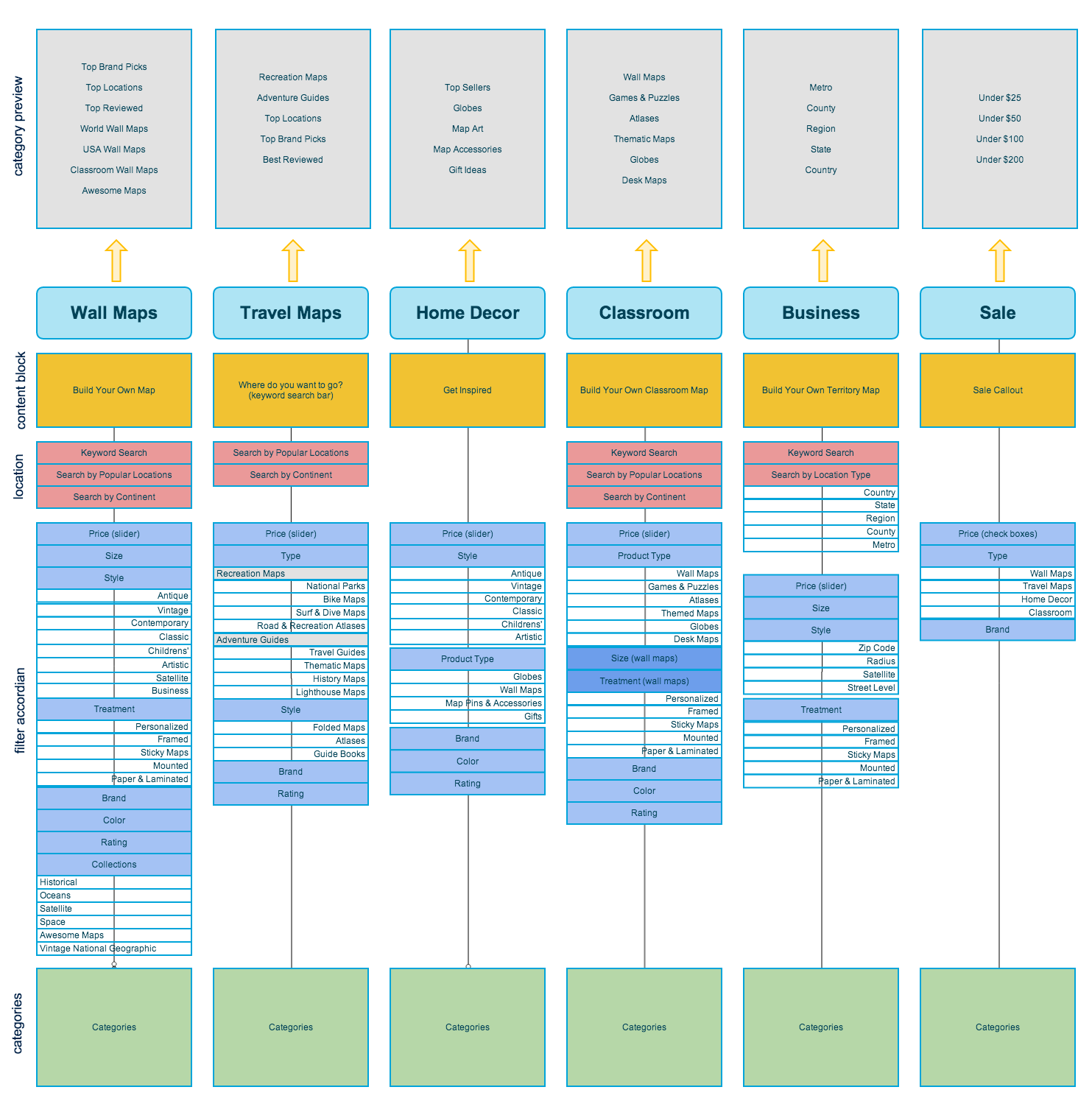
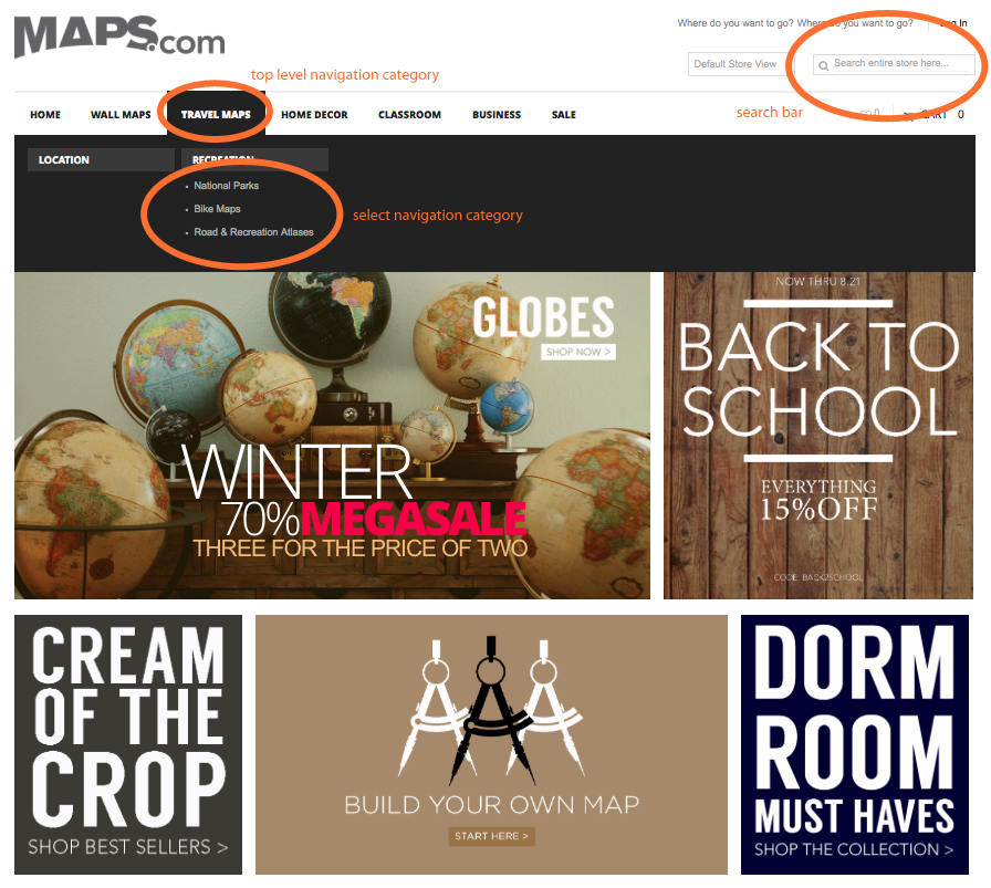

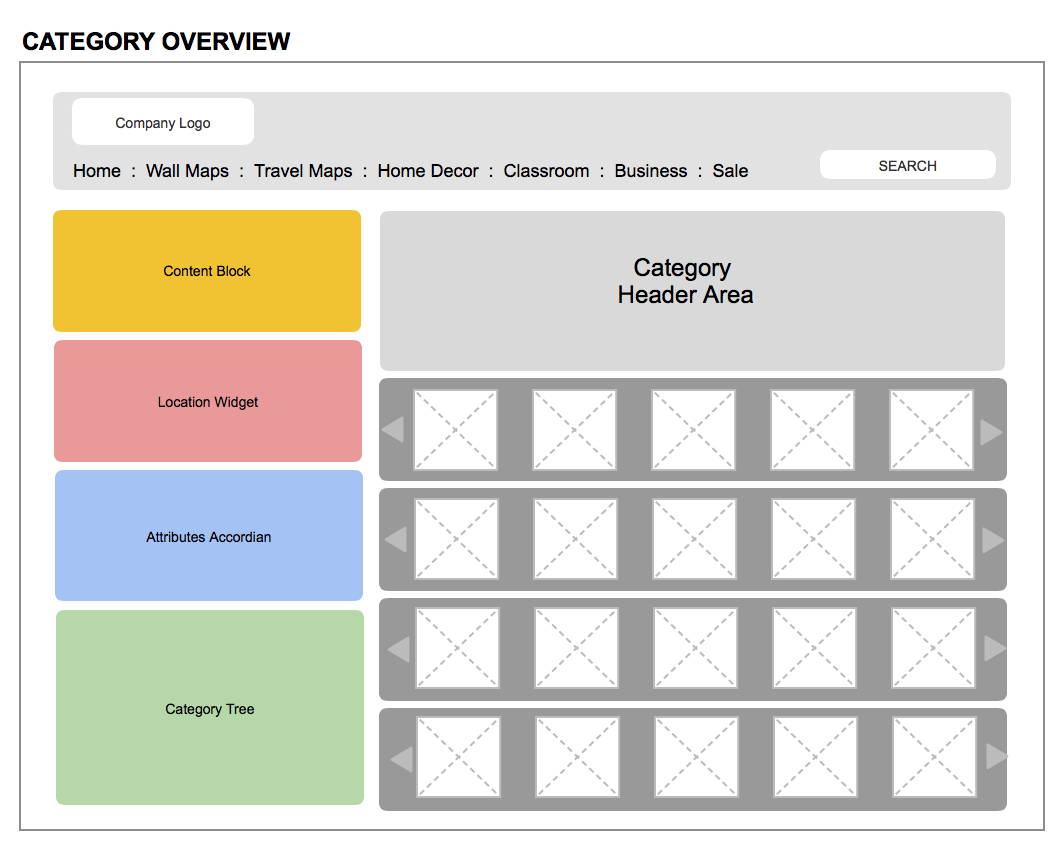


Three clicks to purchase. That is my number one principal in designing for eCommerce. Therefore, category pages have to be intuitive, serving up exactly what a user is expecting (or obviously parsing down) with each click.
Based on where users are coming from (as determined by the homepage navigation structure and other funnels specific to persona types), and the grouping of our product types, I determined that we needed to create six persona-specific category pages, each with uniquely architected filter navigation “widgets”.
To make it easy for our devs to understand the concept, I constructed some low-fidelity “overview” wireframes and a category “cheat sheet” for their reference.
DISCOVERIES THAT INFLUENCED OUR DESIGN
The greatest lessons learned from the product category exercises were determining what qualifies as a category, what elements are filters, and what are sort. Each category page is bound to be at least one click (a page refresh, or a sense of starting at the mouth of the tunnel). Attributes, then, should be easy to select and deselect, never giving the user a sense that they are going much deeper into the tunnel, just deleting potential paths. Once they have filtered based on attribute, they may sort to get a finer-tuned list.
I designed the left navigation with selector elements for quick filtering, and made sure to only include the location search widget for categories whose products were most likely first filtered by location.
New Feature: Custom map builder
We recognized an advantage in utilizing our Print On Demand capabilities that could drastically cut down user search fatigue by optimizing our current Radius Map Builder concept and applying it to other market channels.
ANALYSIS OF THE CURRENT FUNCTIONALITY
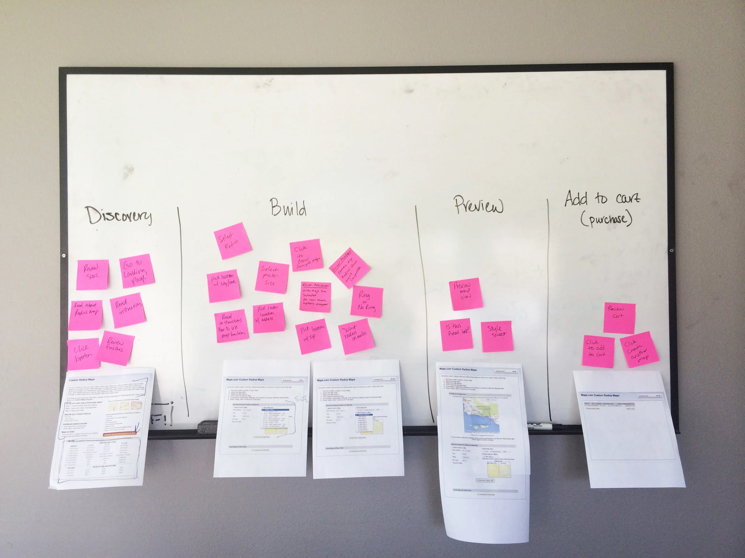
I began by printing out each step of our current platform and taping them onto a whiteboard to analyze the flow, separating them into four stages: Discovery, Build, Render, and Purchase. With post its, I teased out each task that currently existed (adding new ones we wished to include) and assigned them to each stage column. In designing the user flow, I identified goals to each step to be considered in the new design.
I recognized immediately that the physical steps/number of clicks did not match the mental model of the user – there were far too many pages to click through, causing confusion for the user, and unnecessary cognitive friction. It became my goal to chunk each step so that the user would feel “done” and ready to move on to the next goal in a fluid, intuitive manner.
USER/TASK FLOWS
I sat with my team, and together we determined the flow for each builder platform, from discovery to checkout. Keeping our personas in mind, I took note of the differences in feature sets for our business customers vs our decorator customers, based on needs, inventory, and goals.
DESIGN DECISIONS:
Before fully launching into the builder, present a seemingly simple step by step pop up to let the user know what they’re getting into before throwing them into the builder itself.
Once in the builder, keep the map in plain view and LARGE so they may see a “preview” of what they’re designing as they enter in their variables.
Allow for the radius ring to be turned on and off and independently mobile from the preview square – user feedback had alerted me that this was an issue for cities close to oceans, as the final print would be half water, which was useless to them.
Allow the user to name their map, order more than one in one build session, and see their final price based on their selected variables.
Map styles should be presented as “styles” when it is all one publisher (e.g., radius maps), but as separate “branded builders” when the publishers change due to confusing cost differences.
A final rendering is ESSENTIAL in the buying process (when available) – the cost of the maps are simply far too high for users to be willing to blindly purchase, particularly decorators who are not using a company account.
Users should be prompted to make changes after the rendering, and after purchase, be prompted to build another map or go directly to the cart.
INTERACTIVE PROTOTYPES
Given the “ludicrous speed” directive I was given by the project lead, I jumped straight into prototyping some quick sketches we agreed upon to quickly include in a scope doc to send to some devs we were working with in building the eCommerce portion of the site. I found that presenting the developers and stakeholders with interactive wireframes (made in Axure) helped speed up the process of understanding the final product. I was also able to send them links to the prototypes for easy reference.
Decor Vertical – MAP BUILDER
This is the first iteration of the map builder designed for the decorator persona. It is different from the radius map as there are multiple publishers to consider, so each builder is specially branded and costed accordingly. The funnels to get to this builder are such that it can be advertised in content blocks throughout the Maps.com site, featured in brand/style categories, and suggested throughout points of the buying process to up-sell the brand by making it easy to create triptychs, personalize locations, etc. via a quick and easy builder (over tirelessly searching the site).
Business Vertical – RADIUS MAP
This design is geared toward our business personas, allowing for them to preview in both landscape and portfolio, and the ability to turn the radius circle on and off. Again, the design is focused on keeping the user within one cognitive space as they build, even dismissing the instructions as a popup prepping them to be launched into the build process. Only when they are prepared to buy are they ushered to the checkout, but again, not before being prompted to build another map. The preview is essential in upping conversions. In this scenario, we present the map styles as “styles” within the builder rather than individual “products” as the data points between these three maps are comparable and run around the same price.
COMMUNICATING REQUIREMENTS
I used Snagit to relay additional design/functionality changes that need to be made during the building process. Everybody loves arrows and text bubbles.
The most important lesson I learned from this part of the project was that the interactive wireframes looked too “done”, and the developers initially developed everything to the pixel. I had to then explain that this was in accordance to our current CSS, and made sure to point to each element and connect the code for them via Snagit.
ENHANCING QUALITY OF PRODUCT IMAGERY TO INCREASE CONVERSIONS
It is becoming widely known that the bigger your product images, the better converting your pages are going to be. Particularly with art, people want to see detail.
The more you help them visualize how the product will fit into their life, the better. With this concept in mind, I hand selected a series of editorial backgrounds to superimpose the map images on top of. Again, these were selected according to persona.
As we have thousands of skews, I worked with our devs to create a quick script to make it all possible pre-migration.
Maps.com SOLUTIONS WEBSITE ReDESIGN
Custom Cartography is the backbone of Maps.com. We provide custom cartography services to some of the biggest brands in the nation from the Hilton franchise & The US Navy to lesser known, but well loved In-N-Out Burger.
Our clients have specific needs and our website needed to be able to guide each industry/user to the products and services best suited to those needs. In order to accomplish this, we divided our services, products, and sales messages into 5 distinct categories. Each category is clearly labeled and accessed above the fold. Working closely with a visual designer, the end product from our discoveries proved to be a vast improvement.
RESULTS
Since launching the new Maps.com site and the cartographic solutions site, the new IA, feature sets and attention to persona-driven lifestyle imagery increased conversion by 40%.
