L P D

Alto Challenge

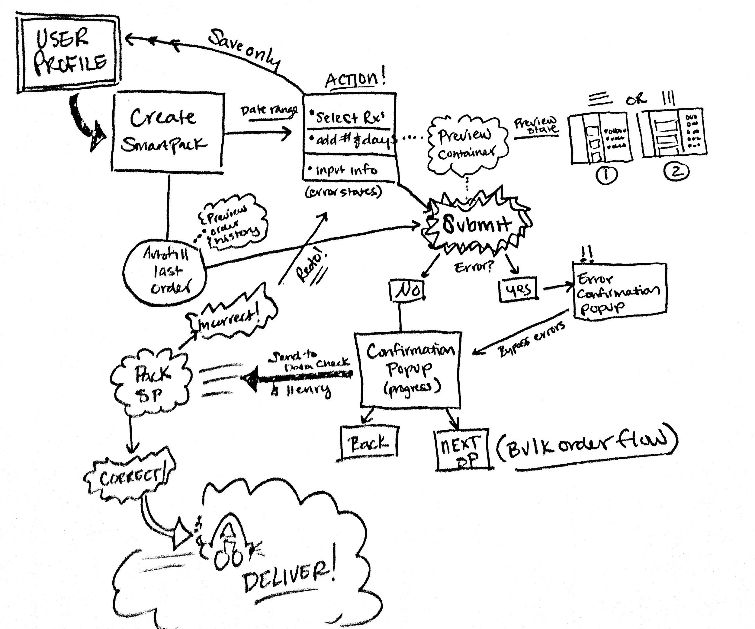
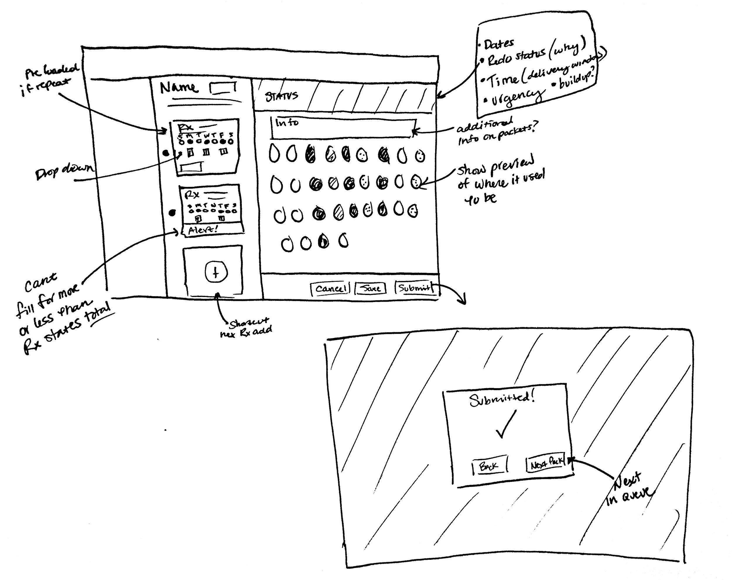
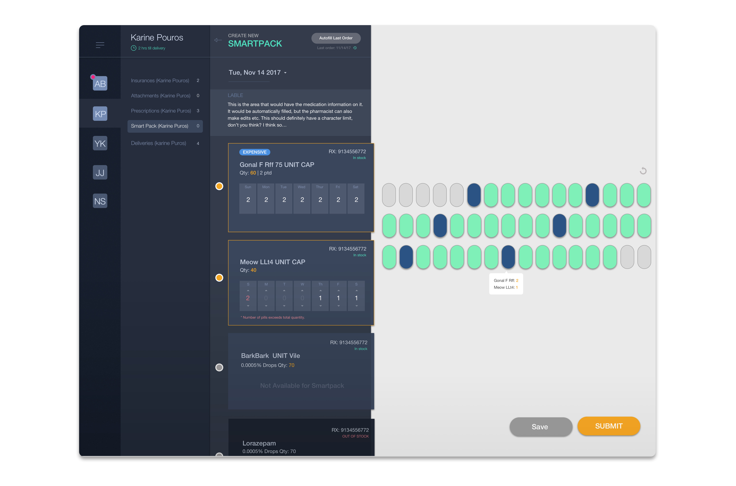
Design and ideate a simple interface for our pharmacists to select which prescriptions are packed by the machine, and what day/times they should be taken. There should also be a component that allows the pharmacist to see an overview of what the patient is taking. We can assume that the dosing schedule repeats on a weekly basis and the entire pack consists of 28 days.


"We want to provide our customers with the best service, which means quick, free, and accurate pharmacy delivery."


FRAMING THE PROBLEM

Is the problem human? What is the root cause?

How do we know this is the correct problem?

How can we measure its success?


time.jpg

Promote Speed & Efficiency

To corner a market reliant on delivery to achieve user satisfaction, the speed in which it gets out the door and into their hands is a key variable in product success. The quicker somebody is able to input and fill a Rx, the faster it can get down the pipeline. Designing for task time reduction results in faster delivery & happier customers.

How?

  • Reduce necessary actions
  • Automate repetitive tasks
  • Pattern flow for bulk action
  • Reflect patterns human is used to
  • Make easy to scan (accessibility)
  • User color instead of text when possible

How to measure:

  • Time spent completing tasks within "create SmartPack"
  • Time it takes from intake to sending to data check.
error.jpg

Reduce Human Error

One of the biggest pain points for both system and end user is having a hiccup in the pipeline. A slower delivery is forgivable. A WRONG delivery is not acceptable, particularly when the materials are medication related. Designing to reduce mistakes is necessary in helping the human components of the process stay on track.

How?

  • Make fields required
  • Autocorrect
  • Call out potential errors before submission
  • During bulk pattern flow, signal change 
  • Keep important info LARGE and prominant
  • "Punishment" vs "Reward" (re-dos)

How to measure:

  • Number of "redos"
  • Number of saved, unprinted packs?
system.jpg

Consider the Whole System

Alto is making some impressive strides toward systemizing their order & delivery flow toward greater speed and accuracy. Designing a solution that takes the whole of the process into consideration allows for functional coordination, ensuring a better end result.

How?

  • Allow pipeline to communicate needs
  • Alert when item is "stale" (visual, sound, phone)
  • Measure and track snags for fixing
  • Reduce "re-dos" 
  • Alert when there is a line backup

How to measure:

  • How many packs had to be done the next day
  • Stale orders in queue (time it takes to get to the order after its been submitted)
 

fulfillment Flow

1C5A2988-8B82-42DF-9590-3FB34FE1C482.jpeg
 

Constraints

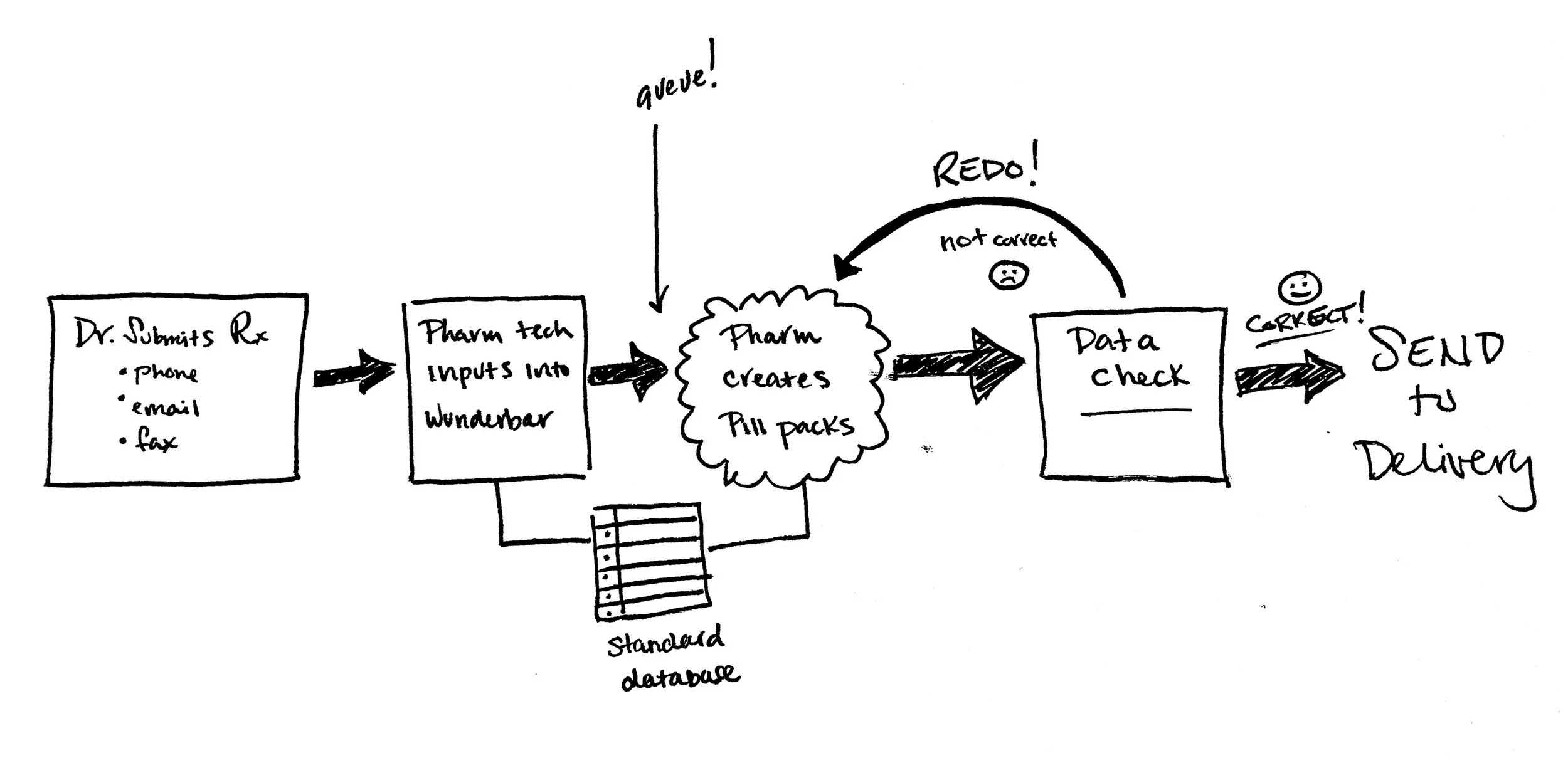
  • Alto will only hold up a line for about 30 min. If something needs to be redone, it has that window, or else it will be VERY LATE or need to be done the following day.
  • Made for desktop web, most computer sizes in the office can account for 1366px.
  • HIPPA guidelines require for a screen to blank health info if left for too long without activity.
  • Pharmacists are accustomed to seeing patterns of FREQUENCY due to the nature of manually filling the machine.
  • Pharmacists usually bulk fill, at an average of about 10 a day (as of now).


SOLUTION


CROSS CHECKING DESIGN

Is the solution VALUABLE?

Is the solution MARKETABLE?

Is the solution USABLE?


Product TASK FLOW

 
A1E2A581-A485-43CB-8108-1342C3B90A03.jpeg


CREATE SMARTPACK

I chose a horizontal drawer layout, increasing screen area for current tasks, while keeping other elements like full order queue and user profile info just visible enough for easy reference and toggle activity. 


Key tasks:

  • Review and edit information text (what user sees on package)
  • Review date info & # of days (edit if needed)
  • Select prescriptions to fill
  • Select which days to fill (unless everyday) and # pills per day
  • Add new Rx from view (?)
  • Preview pill container UI to check accuracy
  • Save and return to later (if not immediatley submitting)
  • Submit to fill
 
66BD5556-6F37-4B4E-A840-254F427AC41F.JPG

Error states & system alerts

To protect against overfilling, I set each Rx module to only allow for a pharmacist to input UP TO the max quantity number specified during intake, and for the alerts to be intuitive during the task. Autocorrect is enabled in the info field. If a pharmacist tries to submit without correcting an error, the confirmation popup would alert them that something is wrong.

Submission Confirmation - Bulk Fill

The submission popup should show errors if it was not able to send to either the machine or to Data Check, and allow the pharmacist to troubleshoot. The next likely step in the flow would be to make another SmartPack for the next customer in the queue. Selecting "next pack" would automatically go to the "create smartpack" screen for the next most pressing customer (arranged by importance in the backend)


CHANGING PREVIEW ORIENTATION

Watching the technician give a demonstration of the flow, I recall him saying "I usually pack it like this (referring to orientation) because that's just how my brain works - it's easier for me to do it quicker". When he passed the tray over to another woman to assist him in filling, she eventually turned it around. They preferred different orientations.

I wanted to account for this preference by allowing the user to rotate the tray preview. The drawer layout worked great for this, responsively adapting to accommodate the new state.

 
217A5506-70A0-43B3-99B2-DF3653D51D0F.JPG
 

HIGHER FIDELITY

 
alto_final_frame_white.png
 

Some details I included to tackle edge issues...

  • Add status color indicator on profile thumb - could refer to priority, errors, newness, redo status etc. Anything that would be helpful to see at a glance.

  • Time sensitivity indicators under customer name. If this were a redo, I would include that status there as well.

  • Quantity, stock status, price, and error states are the only accent colors within the Rx module. I am making the assumption they are the most important elements to scan.

  • I am keeping the colors (green and blue) the same for tray preview as the fulfillment display to promote parity.

  • If a user is confused as to what is meant to be in a "hole" (haha, what would you even call those), they can hover to reveal details.

  • If the pharmacist leaves the desk with a patient's info on the screen for X time, the screen will sleep or kick out of view to protect health info (HIPPA guidelines).

  • The info field is limited to X characters. Previewing character count is not shown here but might be a good idea to include. I am assuming there is only so much room on the package to accommodate text.

  • To account for accessibility and readability, I kept the color pallet limited. I would want to validate the font size in case it might be too small.

  • Hitting "back" next to create new smartpack would take the user to the the smartpack list. An option would be to have previous smartpack orders where the pharmacist could hit "remake smartpack", which would load in this view first before submitting.

NEXT STEPS


I typically sketch a lot more than I did to explore more than one option for layout. This time around, I explored maybe two options and just stuck with the one I liked better. I still feel like there is too much empty space around the pill tray preview, it feels a little off balance, but a great place for potential info.


The first thing I would do if I were to be tackling this challenge IRL is make sure all elements included in the design are true, accurate, prioritized, necessary for goal completion, build-able, and fit well within the current environment. For example, some elements would be "nice to haves" (e.g., show fill by/deliver by in the system), but integrating that information would have technical requirements that are unknown to me without digging a bit deeper. Another example would be the information I chose to present on each of the Rx cards. Without talking with pharm techs about what they're looking for/scanning leaves me in the dark. I'd definitely want some clarity there.


In order to get all of that info, I would first grab a new friend in the office who could help me brainstorm and give me a nice big brain dump. I would then shadow a pharm tech for a few hours and watch them work, asking them a bunch of annoying questions, hopefully making another new friend. Then I would take what I have and chat with an engineer about constraints and unknowns, check if we could actually build it, and how long it might take. After all of that, I would want a really smart person to look over my work and try to shoot some holes in it.


Then iterate.

Validate.

Iterate again.

Build.

Repeat <3